Table of Contents
Everyone learns in different ways, and this is especially true in an online course.
Because learning new information online is a much more hands-off method than classroom courses, you want to make sure you incorporate plenty of visuals to help demonstrate your information in the most effective way.
This is the best way to set your students up for success and increase the likelihood that they will recommend your online course to others in the future.
Sticking to only text or only video isn’t conducive for a wide audience. Instead, you should have a variety of content, including tons of different types of visuals.
We’ve put together a list of must-have visuals in an online course to help you create various visuals that help each student fully comprehend the material.
1. Videos
One of the main visuals you should incorporate regularly into your online course lessons is video. Each main lesson should have written and video portions so students can choose their favorite way of digesting course content.
These training videos can be shot in a multitude of ways – as voiceover atop presentation slides, with a host speaking to the camera (like in the example below) or even as an animated video.
Some people learn better by reading while others learn better by watching and listening. Creating training videos for each lesson or main topic is a great way to cater to both audiences.
Having proactive customer service can also help you to get feedback directly from your students on their favorite ways to learn and digest new information.
2. Screenshots
Another important visual to include within your online courses, especially when explaining step-by-step processes, is screenshots.
For example, if you’re creating a course on social media marketing, and one of your lessons is about creating a Facebook Page, including screenshots of the Facebook platform as you walk your audience through the process can be immensely helpful.
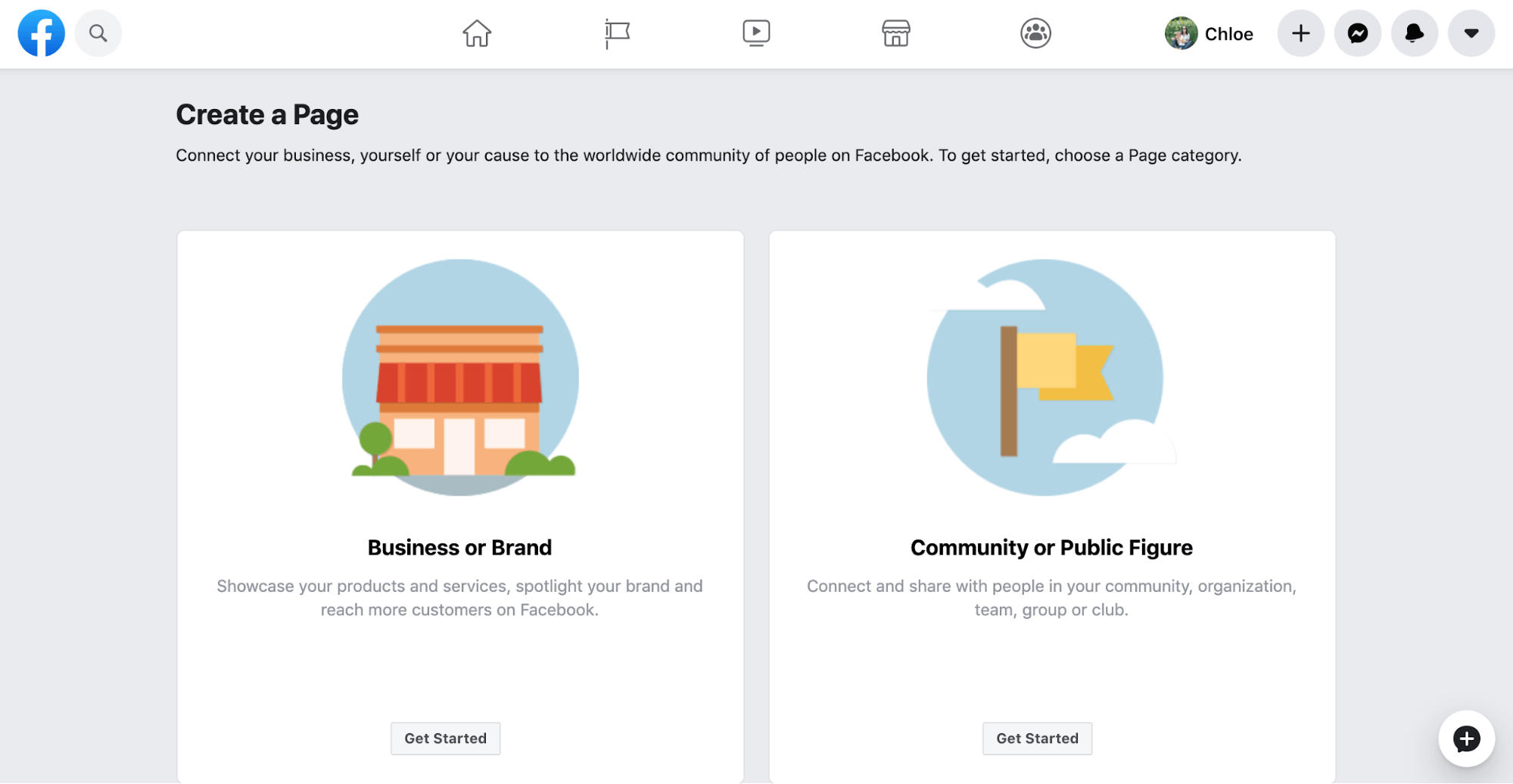
Imagine how much less time it would take for you to simply pop in a screenshot than try to explain what your student should be looking at in a whole paragraph. It’s a win-win for both of you to simply visualize exactly what they should be seeing.
3. Charts and Graphs
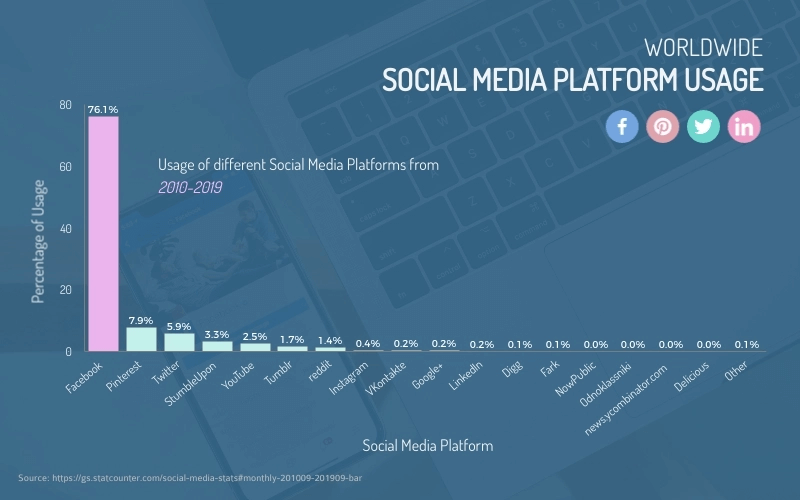
Charts and graphs are the perfect way to help visualize any numbers, data or statistics you want to share within your online course.
There are many different types of charts and graphs to take advantage of when visually representing numbers, from bar charts to pie charts to pictograms and more.
Here’s a great example of a bar chart that would really add to your online course lessons, especially when sharing hard data.
Your steps to creating a chart will differ depending on the type of data or information you need to share, but you can choose from both numerical and organizational charts whether you want to visualize numbers or simply provide a graphic organizer for your content.
4. Stock Photos
One incredibly easy – but equally important – visual to include in your online courses is stock photos. There are tons of stock photo resources available for you to browse and select the most relevant photos to your content.
Using stock photos can help you break up long pieces of text without having to use a lot of time and resources to create visuals.
5. Infographics
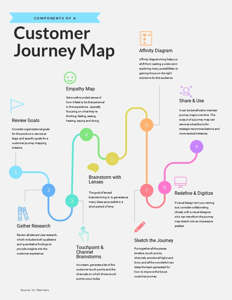
Infographics can be perfect ways to provide supplemental visual information to your online course students. This is because infographics can be used in a variety of different ways.
There are how-to infographics, process infographics, data visualizations, comparison infographics and more. These can be helpful for visually displaying longform content, like in the infographic example below.
You can share visual step-by-step processes with infographics in your online course, create pro-and-con charts based on options your students have to choose from, share important data and statistics in a visually appealing way and more.
6. Timelines
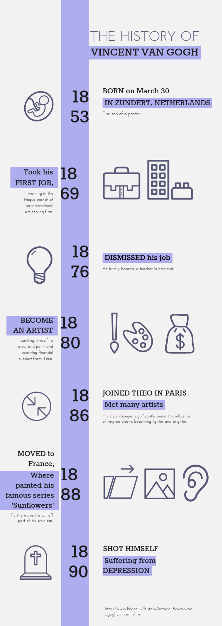
Another great way to share visual information is through a timeline. This gives you the opportunity to visualize a chronological event, whether it’s the evolution of social media marketing or a historical event that’s relevant to your course topic.
Here’s a great example of a visually appealing and fun-to-read timeline graphic that can help your students follow along in chronological order.
Timelines are incredibly versatile and can be used for nearly any type of chronological lesson you need to include within your online course.
When you have longer online courses that can take a good bit of time to complete, offering progress bars for your students to see how far they’ve come is a great way to motivate them to reach the end.
7. Progress Bars
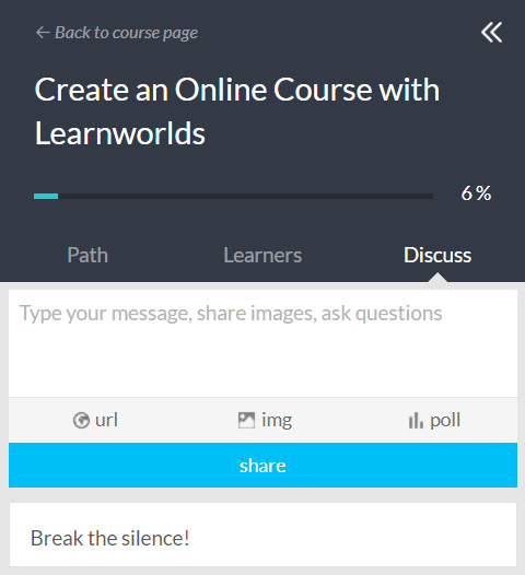
Many online course platforms will include progress bars for you (win-win!), but there are more actions you can take to have fun with progress bars.
If you’ve created a particularly long lesson, you can include progress bars or radials at various sections throughout to help break up content and let your students know how much further they have to go.
Get creative with it, and help your students have fun and avoid becoming overwhelmed while learning.
8. Characters
Another way to have fun with your students is to create or incorporate animated characters to help visualize complex topics.
Using animated characters can help to lighten the mood when talking about heavier or more difficult-to-understand subjects. And we don’t mean characters like Daffy Duck or Spongebob.
Instead, use human-like characters that make gestures and poses to help point out important bits of information, like in this animated example below.
Bonus points if you can customize the animated character to actually look like you! Luckily you don’t need Photoshop skills for something like this – check out a graphic design software that has premade character options for you!
9. Printables
Give your students the option to take your online course offline with printable worksheets, cheat sheets, checklists and more.
This can help students who are still interested in your course and your topic, but might be apprehensive about the online course format, become more comfortable with investing in your material.
Here’s a great example of a printable that could be created in alignment with your course content to help students get even more out of your topic and material.
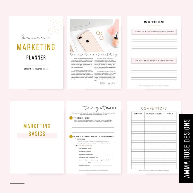
Offering hands-on content for students to put what you’re teaching them into practice is a great way to improve the quality of your online course.
10. Icons and Illustrations
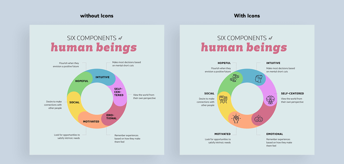
Another great way to help visualize your text and break up large chunks of content is to take advantage of icons and illustrations. These are perfect to use in graphics, infographics, presentation slides and more.
Here’s an example of a graphic that incorporates only text versus a graphic that also uses icons to help visualize main points.
It adds so much more to this graphic, and you can do the same thing within your online course. Whether you create graphics to use within your content or simply use an illustration relevant to your topic to help break up text, these visuals are major assets.
11. Animations
Adding a bit of animation into your online course is another great way to help your students pay attention and focus on the material. There are several ways to do this.
First, you can create animated and interactive visuals that you embed within your online course pages and use as pop-up quizzes.
For example, using a software like Visme, you can link objects in a design together so that when someone viewing your project clicks on or hovers over the first object, the second object appears.
This is perfect for creating interactive quizzes and study guides for your students to gauge how well they’re retaining and understanding the course material.
You can see an example of this in action here.
Another great way to use animation is simply by creating animated graphics that are relevant to your course content and help visualize various points.
This could be an animated flow chart or graph or an animated illustration with text. Here’s a great example of an eye-catching animated illustration you could utilize within an online course.
Or you could create a landing page and upload the graphic as is to promote the content in your online course.
Start playing around with different ways to animate your online courses and interact more with your students.
12. Visual Guides
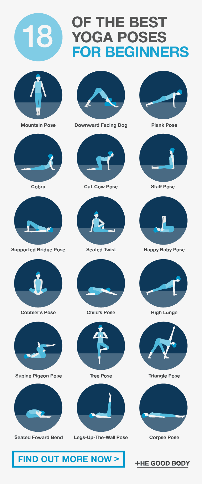
If you need to show your students how to do something, like if you’re trying to teach yoga online, it can be next to impossible to explain the various positions and movements with written words.
This is where visual guides come in. Continuing our yoga example, you can use photos of models (or yourself as a teacher!) demonstrating the various poses.
Or you can create a visual guide like the example below using characters to show off the different poses.
Visual guides can be useful for nearly any industry and any online course, so consider ways to create guides and demonstrations for your students that make your concepts even more clear.
Start Creating Visuals for Your Online Course
Incorporating visuals like these within your online course is a great way to start successfully teaching online and helping your students learn content even more thoroughly.
Stop creating generic text-and-video-only online courses. Wow your students by providing infographics, printables, illustrations, animations and more to help them learn and understand the information.

Chloe West
Chloe is a Content Marketing Manager at Visme, an online graphic design software. She loves to write about digital marketing and design and find new ways to engage audiences through content. Chloe is based in Charleston, SC, where she loves exploring her city with her son.


