Table of Contents
We’re beyond excited to introduce the new interface of our powerful Site Builder – promise, you’ll love it!
With this upgrade, we bring together fluent design, improved navigation, and a 360° view of the website content to create the smoothest, easiest, and most seamless website building experience you’ve ever had.
But first things first, let’s have a deep dive into the changes and the reasons behind them.
Table of contents
🧑🎨 New look & feel
We get it: LearnWorlds’ Site Builder has so many powerful features that sometimes it might be hard to locate the necessary functionality quickly. That is why we introduced a new platform design – clean and minimal. We simplified colors and non-essential elements to help you easily access content and features.
Now you can explore and take advantage of all the powerful features Site Builder has to offer in the fastest and most efficient way.
“Wow! First off, let me just say that our team is LOVING the redesigned Site Builder. This is such a big improvement — and it’s already saving our team a ton of time. Everything seems faster and snappier. How could you not love that?”
🚀 Intuitive navigation
At LearnWorlds, we believe that website creation and management shouldn’t be tiring and time-consuming. Our almighty Site Builder already allows you to create a stunning website in a few minutes.
But there is no limit to perfection, so we decided to make the process of building your website even more intuitive by introducing enhanced navigation between your website components.
All your school’s elements and contents are now unified and conveniently located in an upgraded sidebar. You can seamlessly navigate between all your pages, pop-ups, blog posts, and funnels. It takes just one click to make the change – clone, delete, preview, or access content properties directly from the sidebar.
🔁 Streamlined editing
Website building doesn’t stop with a launch. We know how much time you’re investing into managing your pages, updating content, improving funnels, re-writing blog posts; you name it. We accelerated the editing process to make all these never-ending tasks easier and save you time. How?
Embrace complete control over your website structure and content: all your pages, pop-ups, funnels, and blog posts (and their status as well!) are now always in your line of sight.
Switch between website elements on the fly when you need to, check the data of the content you’re editing in real-time, and easily stay on top of your website’s characteristics and settings.
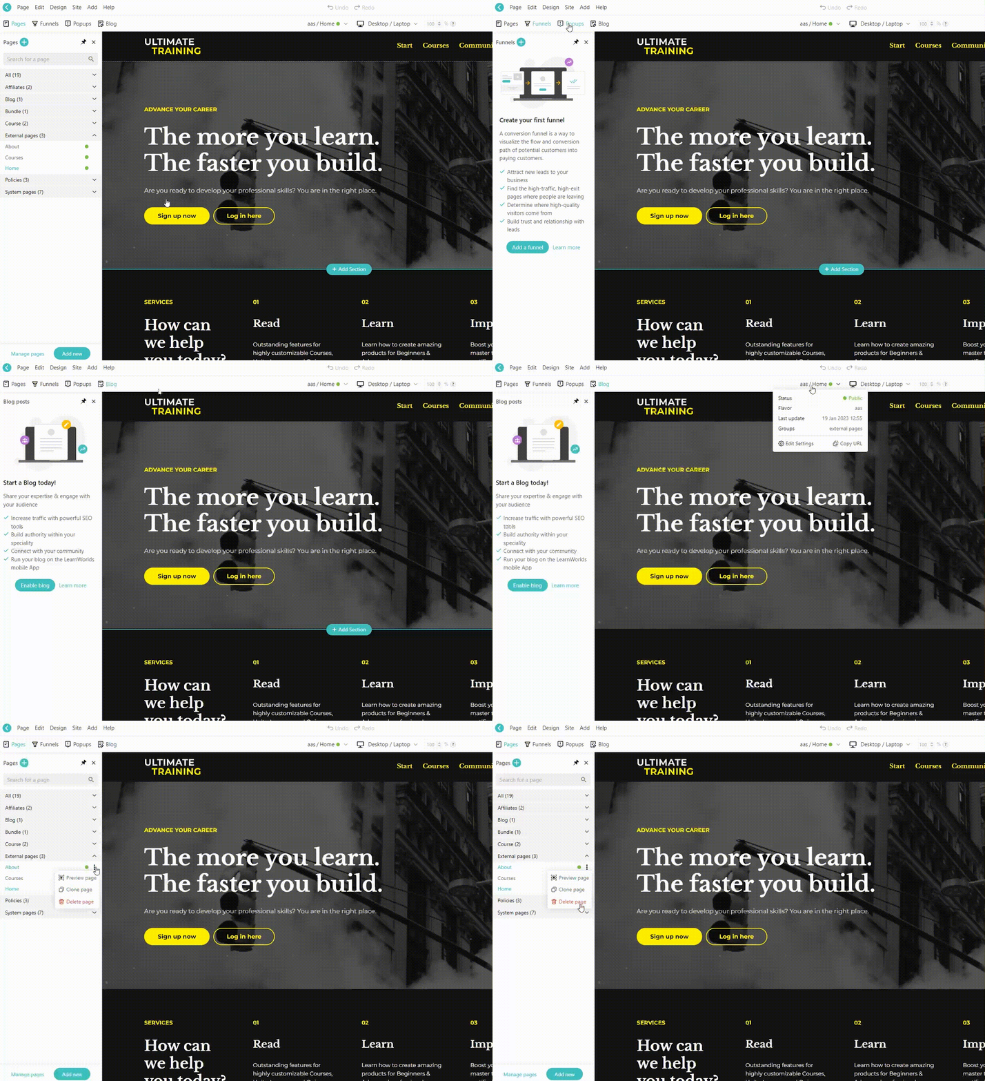
All your website data is now at your fingertips. Access the information about the content you’re currently editing from a handy “Info Panel.” You can obtain the essential information without interrupting your work, whether it’s a page, pop-up, blog post, or funnel.
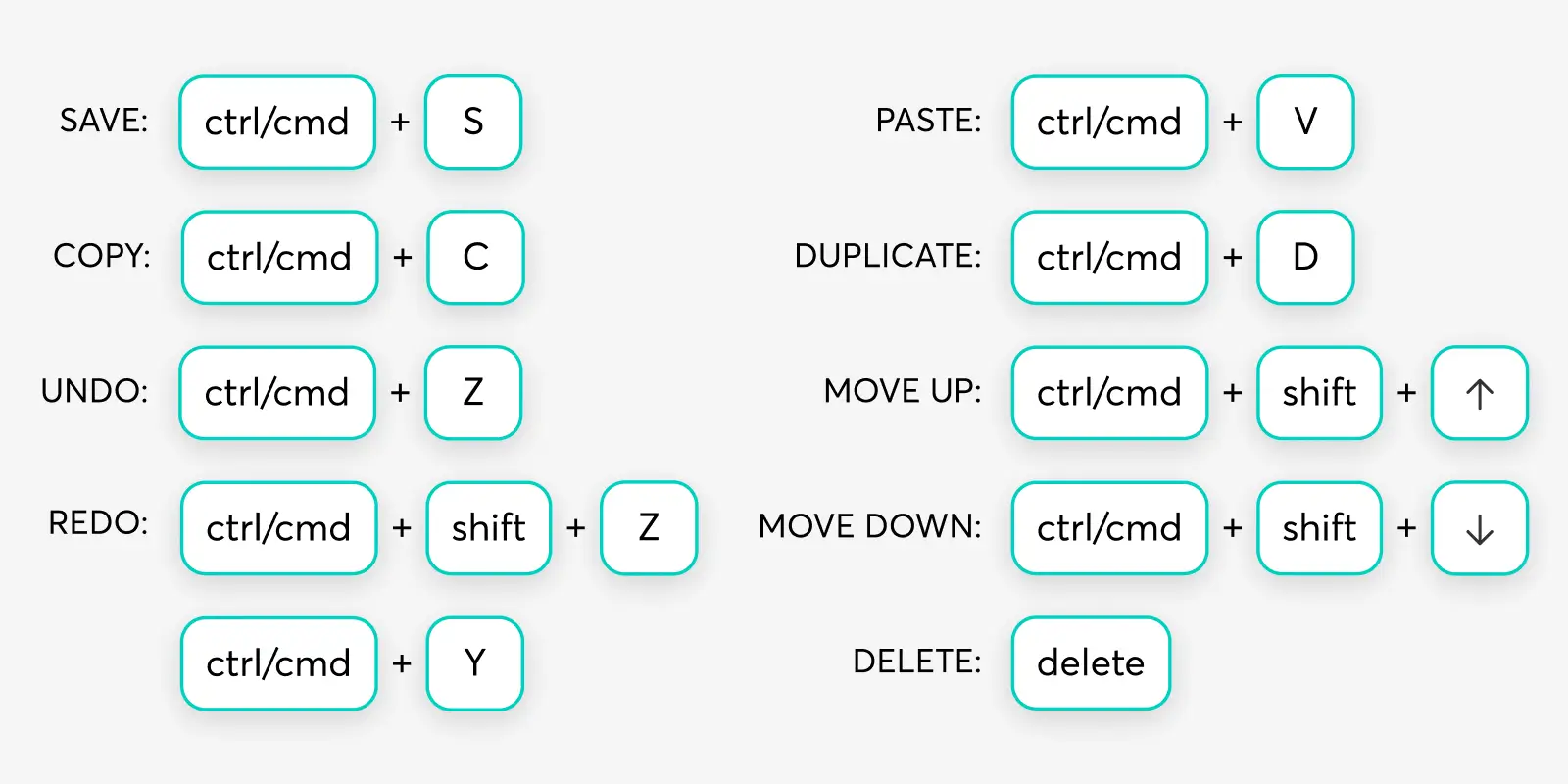
Edit your content in a matter of seconds. No, like literally, with our newest shortcuts, all it takes to take the action you need is pushing a couple of buttons on your keyboard. Here’s a list of combinations you can use to modify your content.
With all these changes, building your website is a piece of cake.
Even though the Site Builder gets a fresh look and some undoubtedly impressive enhancements, its essence hasn’t changed a bit – it’s still the most powerful, flexible, and feature-rich website builder in the market.
Over the years, the Site Builder has been receiving love letters and compliments from LearnWorlds course creators. Here are the top 5 website builder features school owners value the most.
It has a rich templates library
The best thing about creating your website with LearnWorlds – you don’t need any design or coding experience to launch a stunning site that captures visitors’ attention from the first seconds.
All you need to do to get your website up and running is to follow 3 simple steps:
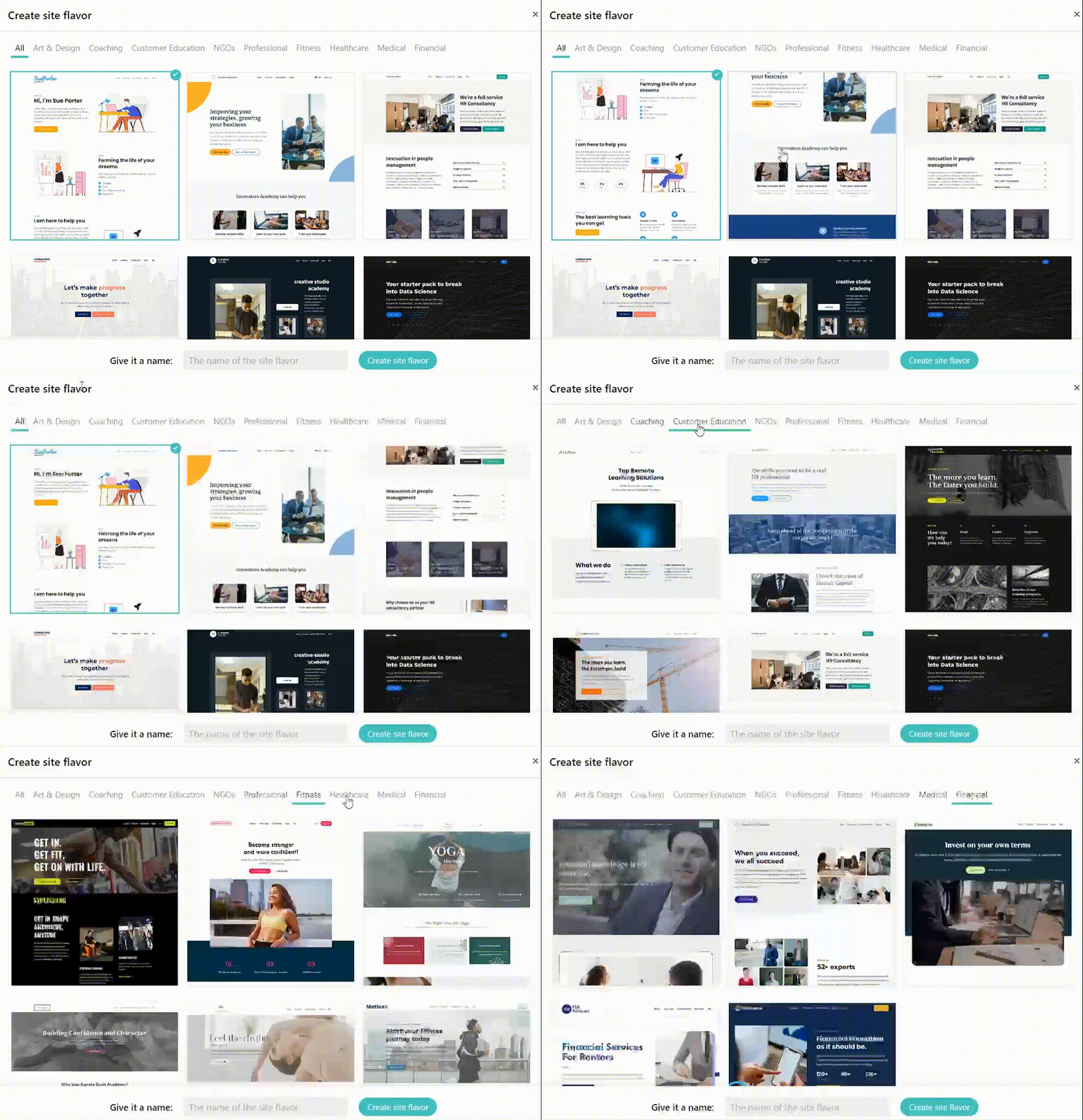
LearnWorlds Templates & Site Flavors are a perfect way to launch your school website without a single line of code. That’s right – just choose a template that fits your Academy style and business purpose, make some tweaks to the content and structure to communicate your school’s mission better, and you’re ready to go.
It’s flexible and customizable
LearnWorlds course creators know there’s no ‘one size fits all’ approach to creating your website. That is why they LOVE the flexibility and customization that the Site Builder provides.
Using the Theme Explorer, you can customize every element of your website. From there, you can adjust the color scheme, fonts, buttons, and even page layouts. Best of all, you will instantly see their effects on all pages of your website once you apply the changes.
At your disposal, there’s a plethora of premade color schemes, font combinations, and content layouts to make designing your website a piece of cake. Choose an existing combo, or go your way and build your branded website using custom colors, fonts, buttons, and layouts.
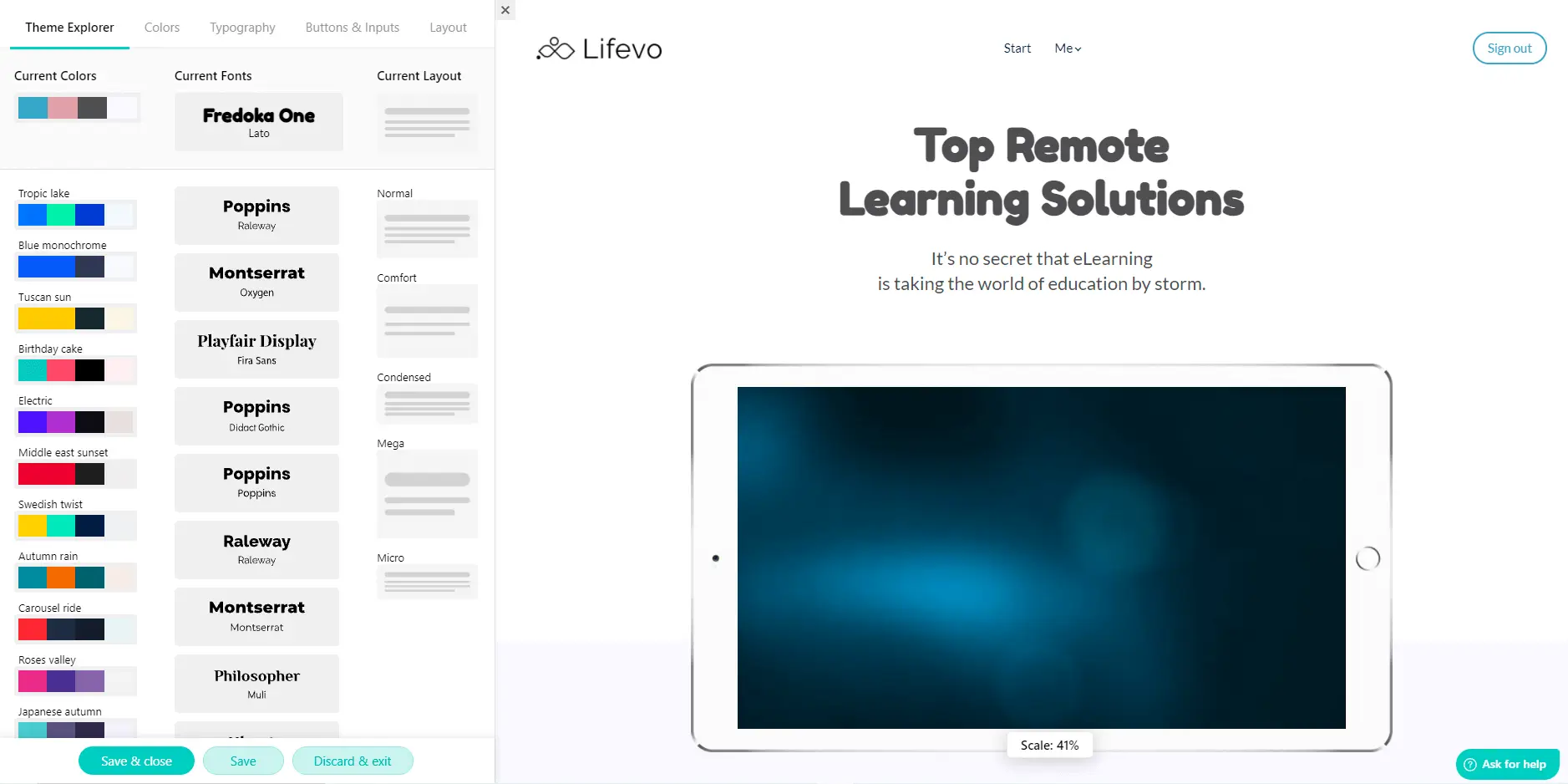
The customization goes even deeper, enabling you to tailor-make all website elements. You can make individual adjustments to every detail on your page – a section or column, a text box, an image, or a button.
From adding or deleting whole sections to changing the sizes and colors of your texts and icons, the Site Builder empowers you to flexibly customize your website the way YOU like it.
It empowers interactivity
A beautifully designed website doesn’t guarantee visitors will stay after they land on it. To capture attention, you have to go beyond the look of your pages: you want to hook visitors and make them scroll down right to the footer. Luckily, the Site Builder ensures that your website not only appeals to users’ eyes but also keeps them engaged.
One of the most popular website trends in the world – parallax scrolling – is available for all LearnWorlds course creators. And trust us, it’s much easier to set it up than spell it.
When parallax scrolling is enabled, the background and foreground are moving at different speeds as users scroll down the page. This creates an in-depth, immersive experience that captivates users and makes them stay longer.
💡 Learn more details about mastering the parallax effects in this support article.
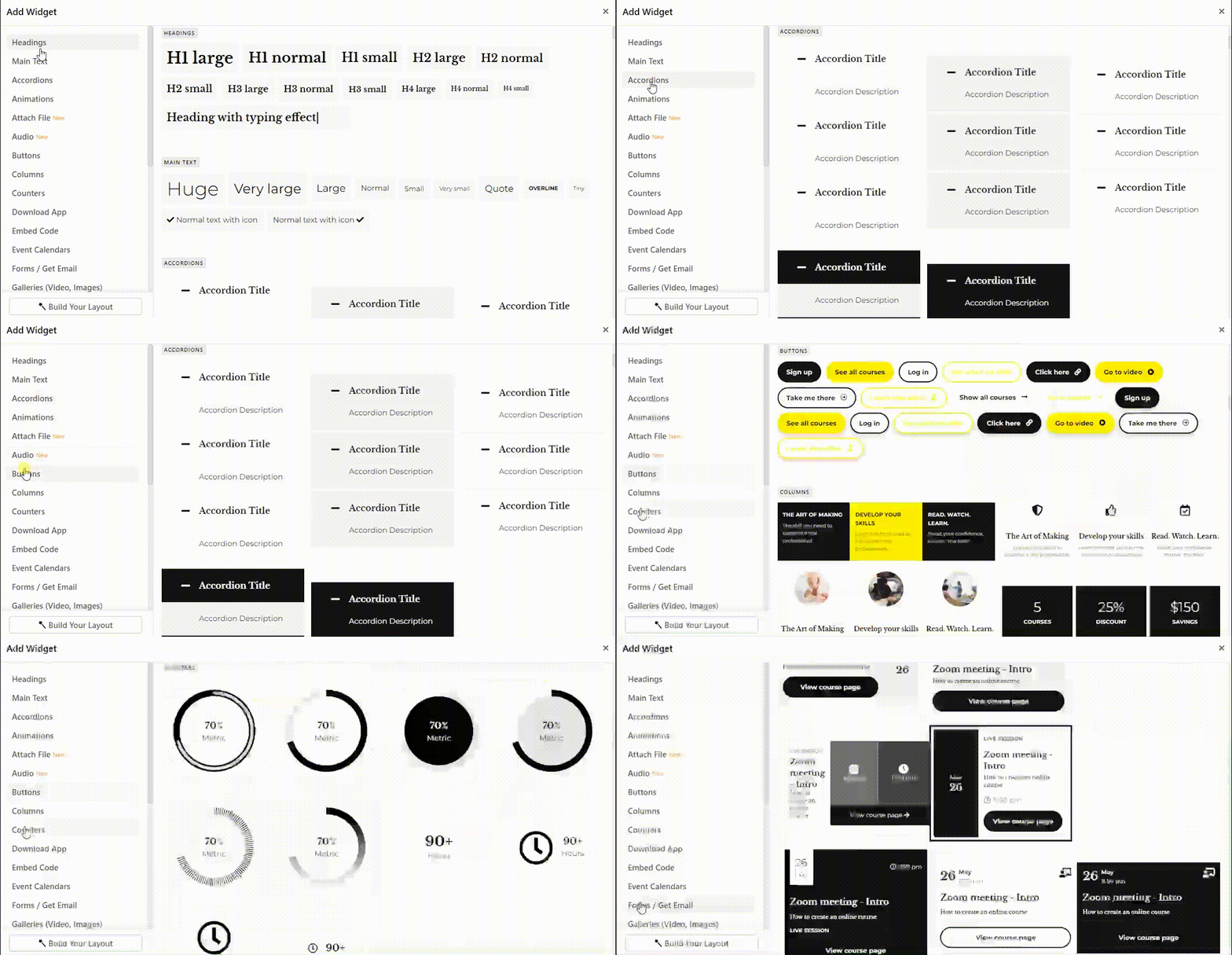
Say goodbye to bland, dry text with catchy animated widgets. Let’s have a quick look at the universe of dazzling widgets you can implement to drive interactivity on your website pages.
📆 Use calendars to announce upcoming events and boost registrations.
🕖 Visually present your achievements with numeric and circle counters.
✏️Turn lifeless content into an eye-catching statement with typing effect.
📃 Compactly display large amounts of information with sliders, accordions, and tabs.
⏰ Take advantage of timers to create anticipation for soon-to-be-launched courses.
Transform your flat, static pages into interactive journeys by introducing the click-triggered motion. Set up an on-click action for any element of your website to create a dynamic experience that draws visitors deeper into your website.
You can enable an on-click action for any text, image, or button element on your page to send users to an internal or external page, another page section, or one of your courses, blog posts, and social media accounts.
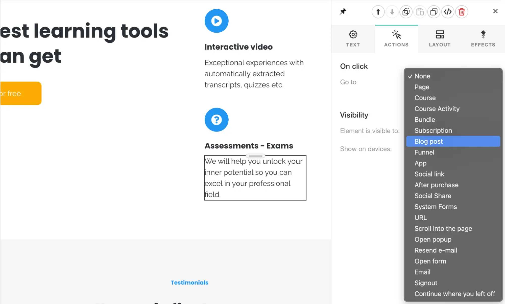
💡 To add an on-click action, click on the chosen element, navigate to the Action tab, and choose a go-to motion from the list.
It drives user engagement
Experienced school owners know about the importance of user engagement. If your website is engaging, the chances of a passing-by visitor turning into a new school student significantly increase without any additional effort from your side. In the Site Builder, you will find several ways to sprinkle some action on your website to keep visitors engaged.
Popups are one of the greatest yet most straightforward ways to drive user engagement. However, if not done correctly, they will only irritate. Fortunately, with LearnWorlds native Popup Builder on hand, you have all the means to create clever, beautiful, and valuable popups.
⭐ Good news: you don’t have to create your pop-ups from scratch. We already took care of it and assembled a comprehensive library of amazing popups for different occasions. Choose any template you like and customize it to match your school style and settings, or create your own fully tailor-made popup.
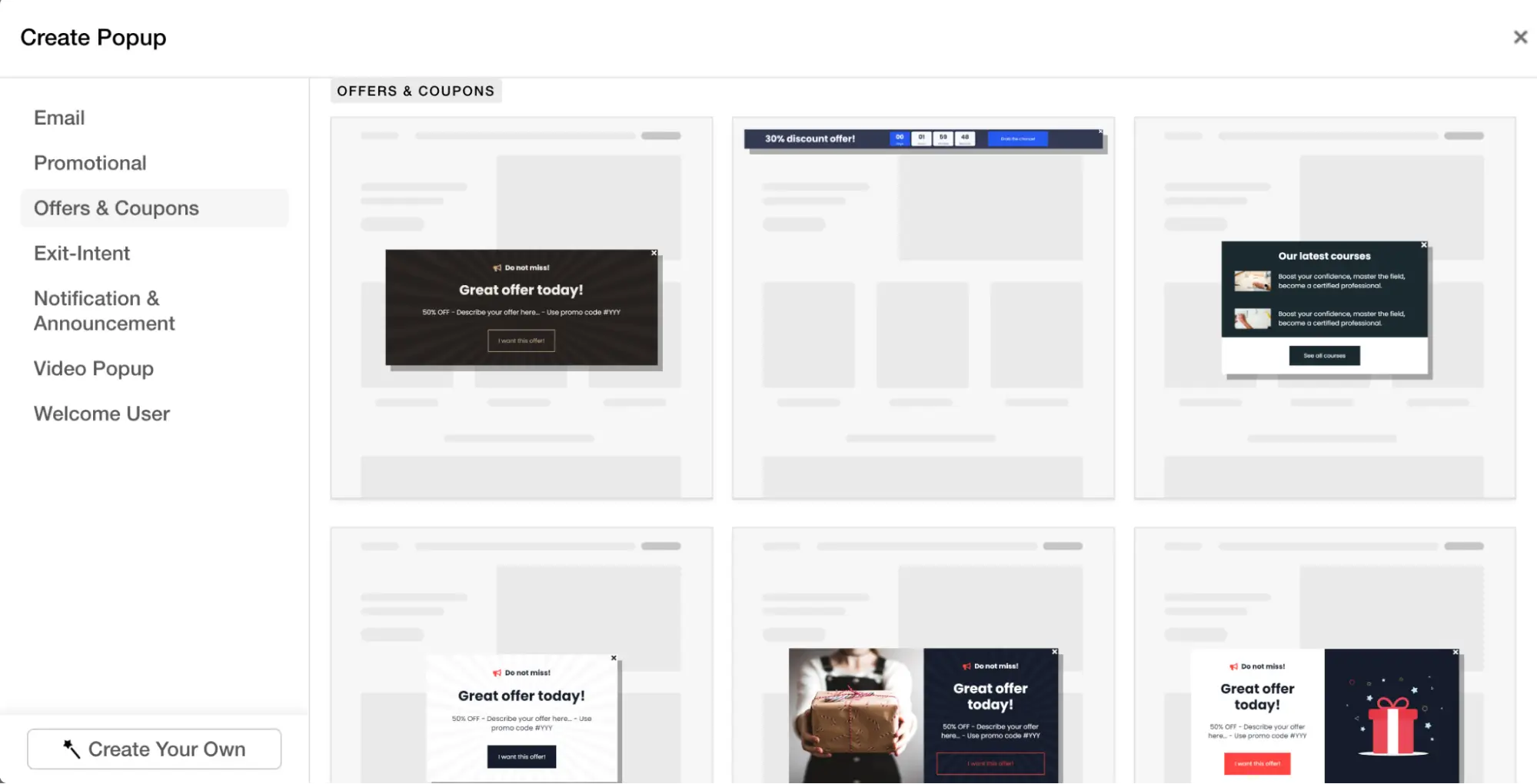
With LearnWorlds, you can create popups that are smart and targeted. Our Popup Builder gives your complete control over the popup settings: it’s up to you to decide where, when, and to whom the popup will be shown.
Take advantage of the built-in segmentation engine and make your popups hit right on target!
To make sure your popups are indeed engaging, you can access embedded popup analytics and monitor views, conversions, and time-open evolution.
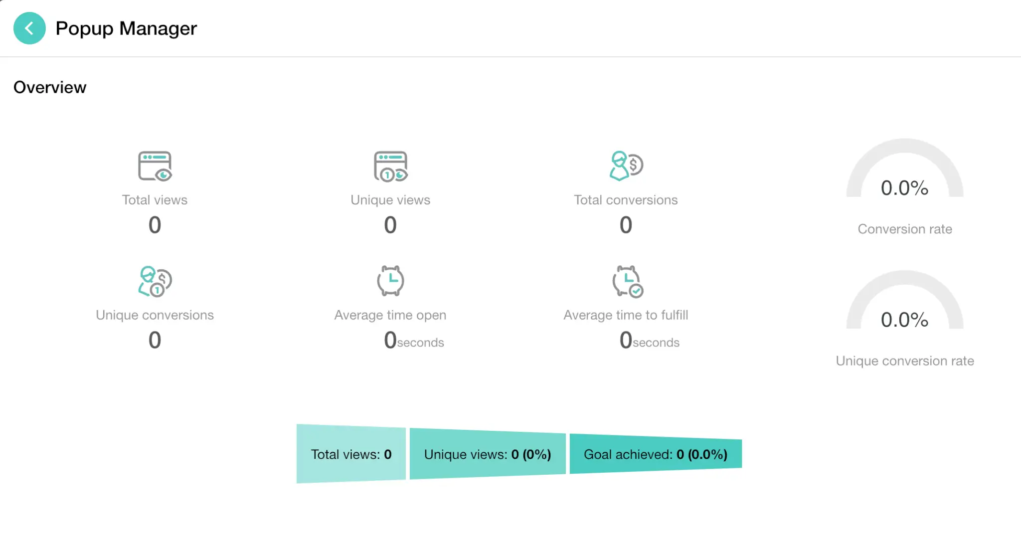
Remember the golden rule of popups: less is better! Users hate closing annoying windows that appear on their screens one by one. Be minimal, and think twice about adding more than one popup per page unless it’s absolutely necessary.
What if you could automate the process of capturing the leads from your website? Using the Form Builder, you can create engaging multi-purpose forms that will generate leads straight from your website. Build your survey from scratch to fit your business needs, or select one of the pre-made form templates to save your time and effort.
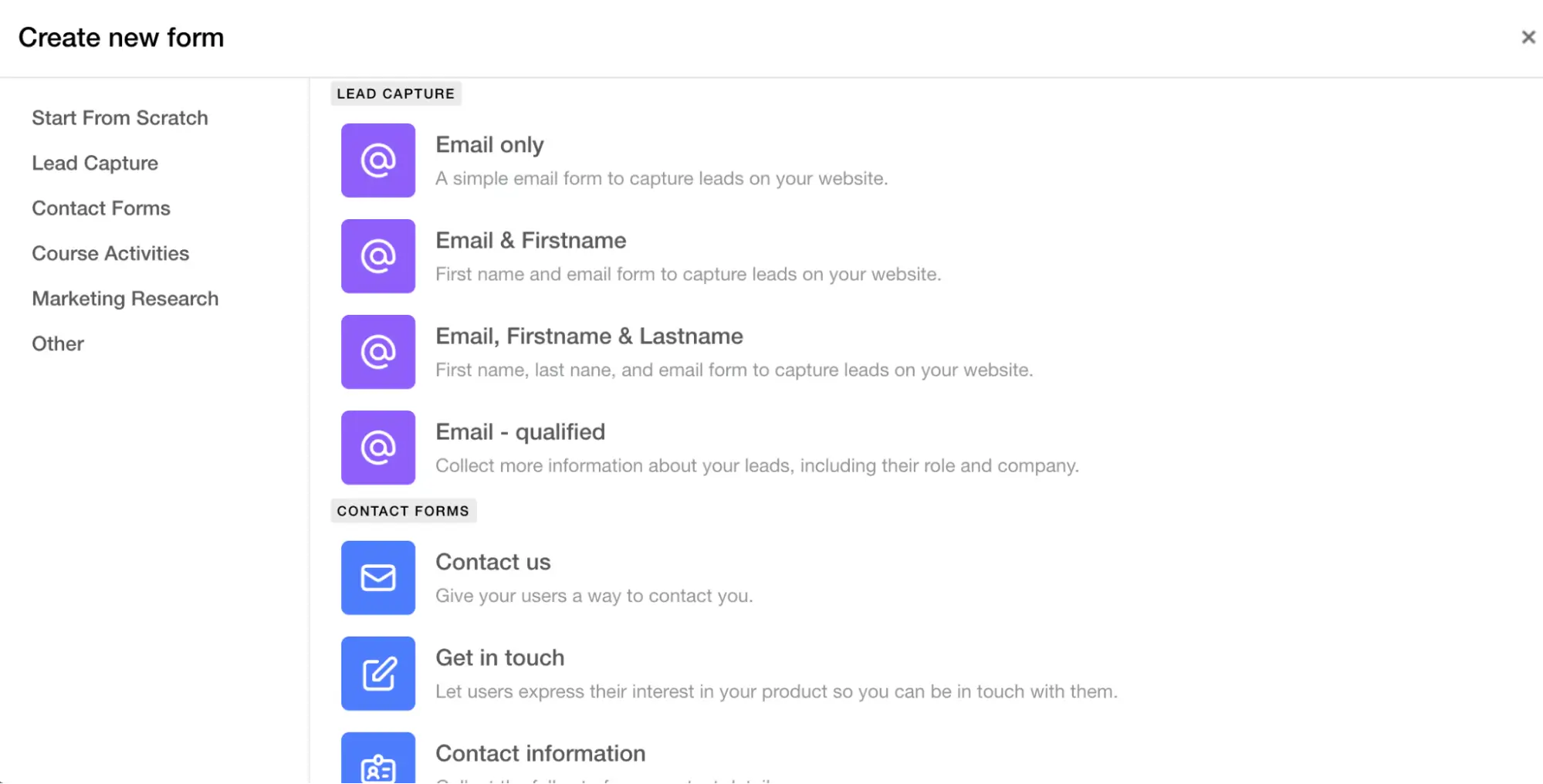
Add a form to your website to gather information about your prospects and generate new leads in your sleep.
It creates personalized experiences.
Any online business owner will tell you that sometimes leads just don’t convert. No matter how many emails you send them, how many discounts you offer, and how excellent your training program actually is.
So, what secret ingredient makes a regular website visitor turn into a loyal customer? The answer is simple – the feeling of being treated special. When a user receives a personalized experience crafted based on their journey, interests, and needs, they feel like they have finally found what they’ve been looking for.
You can create a personalized user experience from the moment a visitor lands on your website using advanced Site Builder capabilities.
Imagine if you could create zones of your landing page that are visible to only specific users. This way, you would be able to achieve better personalization and segmentation of the content you display to ensure it’s relevant and appealing to your visitors. Well, with the element visibility settings within the Site Builder, this dream becomes a reality.
You can fine-tune the visibility to target specific groups or individuals for every element and section on your website pages. Do you want to display a block with the discount offer for new students? Or is your goal to promote a new course bundle to existing learners? Such segmented journeys can be easily created right from your website editor.
💡 To adjust the visibility, click on the element and open the Actions tab. From there, you can set up the visibility based on your target audience. Learn more about the visibility settings in this article.
A personalized journey can extend beyond your website pages, creating a more profound user experience. You can customize the flow further by welcoming your leads with a tailor-made after-login page that speaks to their needs.
Based on your segments, you can present an after-login page targeting specific user groups to deliver a personalized experience. For an existing customer? Show them a new course that is relevant to their learning path. For a new lead? Offer them a compelling discount for your training program that they won’t be able to resist.
With such powerful personalization tools, you can bring context to user journeys to improve conversions and skyrocket engagement. Take advantage of the flexible Site Builder settings today, so your school can thrive tomorrow.
Not every visitor becomes a lead, not any lead becomes a customer, and not any customer stays forever. But in a world where sales are all about numbers, you can turn more visitors into leads, more leads into customers, and more customers into loyal advocates.
With our latest release, LearnWorlds becomes a one-stop shop for building up an academy that not only delivers a stellar learning experience but also has all the tools you need to make your business even more profitable.
Page Funnels are here to automate all steps of the conversion process, from capturing a lead to turning them into customers, so that you won’t have to worry about your buyer’s journey and focus on bringing more buyers in.
What is a Funnel?
A funnel is a one-way journey for users that takes them through a specific goal – course registration, purchase, feedback submission – you define it.
A funnel automatically takes your users through predefined steps, all the way from capturing the lead to a completed purchase.
Make the automation work for you
The more your online school grows, the more processes you must manage. Whether you need to capture more leads, increase email subscribers, close more sales, or build personalized buyer journeys, funnels help automate all the steps of the conversion process.
That way you’re both reducing manual work and removing friction for your visitors, so they can enjoy a smooth conversion experience. All in all, funnels make it easy to:
💡 Read more about the power that funnels hold in this article.
While you’re focused on crafting the best learning experiences, LearnWorlds is happy to provide you with all the necessary tools to support every stage of your school’s growth. Take advantage of the market-leading features to launch and scale a successful e-Learning business, starting with the face of your brand – your website, and to the heart of it – your courses.

Lizaveta Skrobat
Liz is a product marketer with in-depth expertise in product, PaaS, and SaaS marketing. She is adept at a product-centric approach focused on delivering value for customers. Besides helping course creators succeed, she’s passionate about skiing, cooking, and literature.

