Table of Contents
An online course landing page is your elearning business’ door to the world. It usually is the first touch point of your potential customers and often the place they will purchase.
Landing pages are the entry points of visitors and should give a quick look at your course offering. They provide a clear message, a purpose, radiating the instructor’s authority and (social) proof of its results.
Your website needs to offer all the important information to a visitor.
This includes the “About Us” page, the “Thank You” page, the “Contact,” and -most importantly- the “Landing” page. Without this very last piece, not only your website would be incomplete, but it wouldn’t be able to stand alone – not only in terms of web design, but most importantly in terms of content.
A convincing landing page is expected to convert a visitor to a lead or customer at a 2% to 11% conversion rate (source). So, in this article, we will show you how to build a landing page for an online course and improve your results!
💁 Here is how to build your whole elearning website with LearnWorlds. You can start building your website & course with LearnWorlds with a 30-day trial.
What is a Course Landing Page?
A ‘Course Landing Page’ is the entrance page of your online course. It is a no-distractions page to convert visitors into leads or customers.
The main purpose of a landing page is to convince visitors from an online marketing campaign to click the call-to-action button and complete a goal. To do this, the landing page presents specific and carefully-chosen information that encourages site visitors to receive your offer – whether this is the choice to opt-in or to buy your courses.
For online courses, an educational landing page includes the course title, information, learning objectives, instructor information, social proof, price, and other relevant information.
Landing page vs Home page: What are the differences?
There are four factors that differentiate a homepage from a landing page:
Multiple goals vs One goal: While a homepage directs your site visitors to a number of site links and features to help them navigate the site, a landing page has only one primary objective, which is to generate more leads or sales.
Multiple CTAs vs One CTA: A homepage has more links and therefore more distractions than a landing page, which offers a single call to action (which is totally focused on the single goal as described above).
Multiple vs Minimal distraction: Your homepage’s goal is to introduce your online school to the world, so it includes general information about your elearning business and courses and offers several options as a next step to the user journey. On the other hand, a landing page focuses on a single objective; it is laser-focused to that one objective.
Wider audience vs Target audience: In most cases, a homepage’s audience is wider than the course landing page, which focuses on one specific course and goal. For example, you might offer several courses on compliance training, you would mention all on the home page, the landing page on the other side might only talk about the fire safety compliance or a legal compliance bundle.
As Neil Patel points out, the success of each type of landing page is found in their capability to:
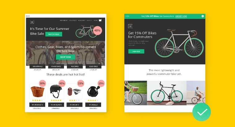
From this perspective, one misstep in the visitor’s path online might make them leave your site. The solution to this is to design a landing page that takes website visitors straight to the desired result.
What does a course landing page do?
Landing pages are one of the major components of the sales funnel, focusing on a single user action. That would be:
Each key element on the landing page has a dedicated role. The role of a landing page during the steps of a learner’s online journey fits as follows:
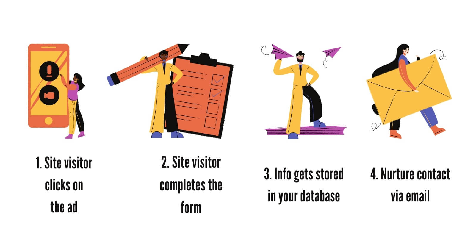
Step 1: A site visitor sees an ad, clicks on it and finds themselves on a landing page (e.g. a course sales page) that prompts them to complete a form.
Step 2: The visitor completes the form and provides their contact details, usually the name and email address.
Step 3: The information the visitor provides is stored in your leads database (e.g., for email marketing purposes). If any contact detail is missing or is wrong, you can use a people search tool to correct your database.
Step 4: You use email marketing to communicate with the generated leads, build trust, and further promote your course.
Why do you need a landing page?
A landing page serves one purpose, different landing page types serve different purposes. A landing page addresses your audience’s pain points and includes the call-to-actions that will lead them towards the next step in the funnel.
Most straightforward landing pages will push people towards buying instead of getting leads (e.g., selling online courses). You can guide visitors through other steps, like:
How Do You Create an Online Course Landing Page?
With a leading LMS like LearnWorlds, you can build your online academy and use our state-of-the-art page builder to choose any of the dozens of course landing page templates for your course.
LearnWorlds provides you with high-converting landing page designs and great ecommerce functionality so that you can sell your online courses with ease. You can try LearnWorlds for free and choose one of the many templates to start!
💁 LearnWorlds’ No-code Website Builder makes it easy for course creators to create pop-ups and every other important element for their online academies.
If you are building your courses on a different platform such as WordPress, keep reading this guide to learn how to build landing pages that convert your visitors to clients!
The elements of a landing page
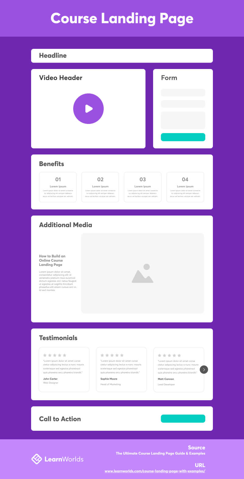
First, let’s discuss the most important elements for creating a successful course landing page. Consider this also as a checklist to a successful landing page:
Headlines & headers
Your landing page’s main headline should be short, explanatory, and actionable.
Your visitors need to understand what you have to offer immediately after they land on the page. So make sure that the headline communicates your message effectively and clearly.
Using the same approach to the secondary headings will help visitors understand what’s in it for them, the value they are getting, and what content the online course contains to help them reach their goals.
Each title holds significant impact, equally contributing to the overall power of your landing page’s copy.
Another aspect of the headline is the visibility. Since it is the first element people will see on your course landing page it needs to be valued-focused and clearly visible. To get this right, you can include large and bold text, clearly separated from other elements.
Action words and phrases
Action words and phrases speak volumes.
Choose verbs and words that have a positive proposition such as ‘discover’, ‘explore’, ‘improve’ or ‘start’ that prompts them to take action.
Engaging media & video
Visual elements support your message. From the colors you choose to the images, and even your own profile as an instructor.
Include:
Visuals convey your message to visitors’ brains before they even read the titles and strengthen their perceptions of your course.
Courses designed for children often feature bright colors and playful images, while business courses may require bold, dark colors and professional stock images.
The most effective medium is video, as it fosters a connection with your visitors, builds trust, and offers superior engagement compared to other forms of media. It is highly recommended to feature an introductory video at the header of your page. (above the fold)
Various video types, including emotional-appeal, news/commentary, testimonials, and ‘behind the scenes,’ provide a compelling glimpse into your course, effectively conveying the essence of your school or course.
Testimonials for social proof
Testimonials are reviews or opinions either from previous students who have taken the course or anyone who has tried your course. They have tremendous influence in the decision-making of your site visitors.
Apart from this, testimonials help you reinforce your brand, strengthen your value proposition, and build your credibility in the online market. Testimonials provide social proof, as they show that you are a trustworthy individual on your subject. These can really come from anywhere — emails, tweets, Instagram posts or comments, blog posts, etc.
Video testimonials are the best way to go. Ask your learners to provide you with a video testimonial if possible. You can easily use video testimonial templates to create great videos for your landing page by editing your students’ reviews.
💡 Tip: If you haven’t launched your course yet, ask close friends, colleagues, or a select few of your students to see the beta version in exchange for a testimonial. You might even offer free access to a small number of people to collect testimonials.
Forms
This is the ultimate medium serving your page end-result point. It is a form that captures email addresses and other important information of people visiting your site including contact names, company names, etc.
Checkouts are also a type of form, when the goal is sales instead of simple lead capturing.
The 4 most important factors for your page
All these page elements we mentioned are based on four main factors that should guide your thinking when creating a landing page:
Let’s dive in to explore these four main factors in more detail…
1. The Product
When creating your landing page, you need to think about your product (your online course) and how it is positioned on the page at all times. Your online courses should be the focus of your landing pages, which is what your website essentially promotes.
The way you present your course helps potential students understand what you are offering and leads to making a better judgment as to whether they need it or not. Since this is a decision they need to take in the first 10 seconds – before they decide to leave your page, you need to think how you can position your product carefully.
You might think that product photography is unnecessary, but the combination of positioning, good visuals, and copy (engaging text) can influence your site visitors to opt-in and buy from you.
Your Brand
Your brand is how you position yourself in the eyes of your potential customers. They are many factors affecting branding, but on a landing page we tend to focus on keeping a consistency between your ads and the destination page.
Your color palette, messaging (text), and visuals should match the rest of your brand (website, social, ads, emails, etc.) and present a consistent messaging.
For example, if you are establishing a premium brand, you want to show that through your pricing, avoid discounts, and price high.
The Marketing Copy
Your landing page’s marketing copy serves as the foundation. It presents the written information that your site visitors will read, and it must align with your business’s unique voice and brand.
To assist you in crafting the perfect message for your page, here are a few questions to guide your thinking regarding the marketing copy:
Question 1: Who is this offer for?
Identifying your audience is key to writing an effective copy and targeting the right people who are going to be interested in your offer. Knowing who to talk to, will help you transform your message to something that will appeal to them.
At this point, it’s essential to come up with a strong headline or title that explains your offer in a few words, gathers attention and gets clicks!
Question 2: What’s in it for them?
Think about how you can approach your audience – test it to people who are potentially interested in your offer and see how it goes. Also, think about whether this page makes sense for your audience. If not, what would possibly make the biggest appeal?
Giving your audience a motive is the best way to encourage your site visitors to give you their contact details, or proceed with a purchase!
Question 3: What should I write?
What you write in your marketing messages makes the biggest impact. This is one of the reasons why you need to choose your words wisely.
Include a short introduction that describes the offer and explains what your school does, list out the benefits for opt-in or buying your course, and then link a post/video/download button to work alongside completing the desirable action.
Overall, your marketing copy should include your offer and the personalized-targeted message you want to send out to your audience. Ensure your content speaks as naturally to others as possible by using conversational tone, and is consistent with your other digital marketing activities.
Don’t forget, though, to maintain a reasonable content volume; often, brevity proves more effective. Moreover, you have only about 2 seconds to make an impression, as most site visitors won’t read everything on your page.
Step 1: Create a catchy headline for your offer
An offer is a product that is related to what you are selling (e.g., your course), and works as a supplementary feature. This could be a checklist, a handout, an ebook, a PDF with important information relating to the course or the subject you are teaching. An offer could even be our course per se!
If you are promoting your course, the headline needs to be captivating and be able to describe what it entails presenting its full value.
A few examples:
A: Learn to fly your drone – A Step by Step guide
B: Do you want to learn how to lose weight in just 20 days? Let’s talk!
C: Learn all the secrets to acing job interviews and landing a job!
Step 2: Prepare an original call-to-action (CTA)
Coming up with effective CTAs is vital to your traffic and lead conversion. Calls-to-action set specific expectations and let potential subscribers know exactly what your website contains. Once visitors arrive on your landing page, these are the ‘action points’ that direct them to where you want them to go and help influence them to do what you want them to do.
Step 3: Decide where to place the CTAs
Plan the placement of your CTAs and ensure they guide the visitor through the buying process. This will help visitors understand where to go next and what to do. Your site navigation should work for you not against you, so that your advertising intentions are met and conversions are not lost. CTAs should be clearly worded, letting people know what you expect of them.
Design and User Experience
When it comes to page design, LearnWorlds can do all the work as it allows you to build beautiful landing pages within minutes through the help of its incredible no-code site builder.
However, you need to be aware of User Experience (UX), at all times and think about the journey of the site visitor. The positioning of different elements on your page is important, as this arrangement helps increase conversions.
Examples of Great Online School Landing Pages
We’ve meticulously curated top-tier and high-quality online course landing page examples from various academies across the web to fuel your inspiration.
Below, you will find examples of LearnWorlds’ capabilities, as most academies are hosted on LearnWorlds.
You can also create your own online course with LearnWorlds, start with a free trial.
1Calisthenics – Muscle Up
Goal: Subscription Trial Signup
Category: Fitness
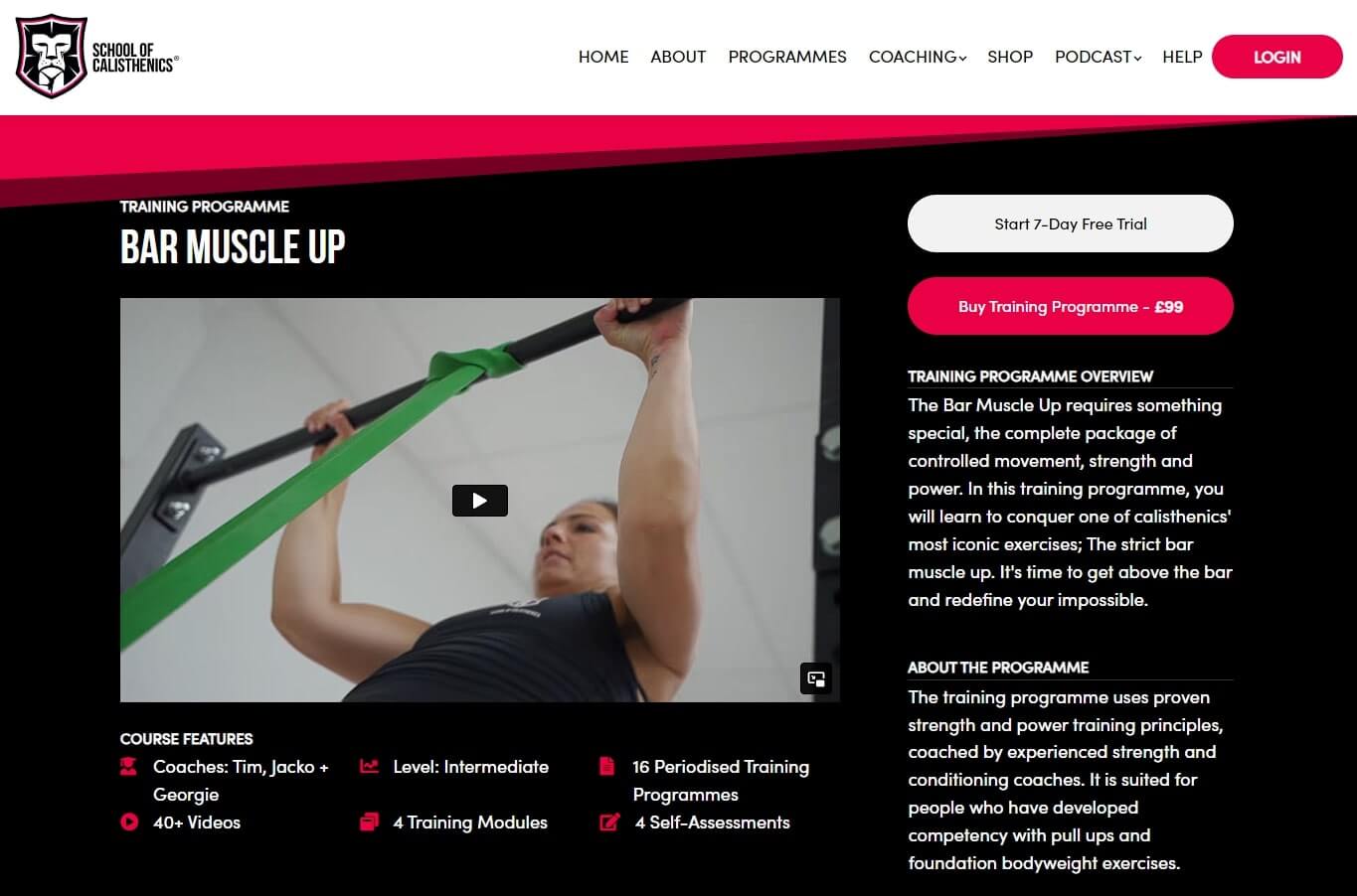
Bar muscle up
The School of Calisthenics stands as a prime example of an academy that excels in design consistency, employs concise and captivating titles, incorporates engaging video introductions, and integrates actionable language in their titles.
Furthermore, the academy leverages instructor profiles, strategically positioned at the bottom of the page, to establish professional credibility and provides a clear call to action for a compelling 7-day free trial, enticing visitors to progress.
However, in the pursuit of perfection, a couple of enhancements could be considered: a) employing more active language to provide a stronger indication or ‘promise’ of results to visitors, and b) bolstering the page with social proof in the form of learner reviews.
2Foundr
Goal: Course Sales
Category: Ecommerce
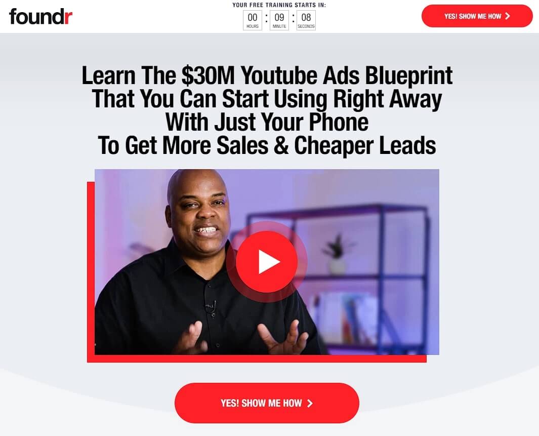
YouTube Ads Masterclass
Foundr uses a very salesy approach to sell online courses to entrepreneurs in the ecommerce space. They focus on celebrity instructors and strong, professional video introductions for their courses, multiple CTAs, benefits sections, and social proof.
A very notable feature is their video testimonials that many of their courses have. They supplement the videos with the person’s name, the result they achieved, and a longer description of their personal story.
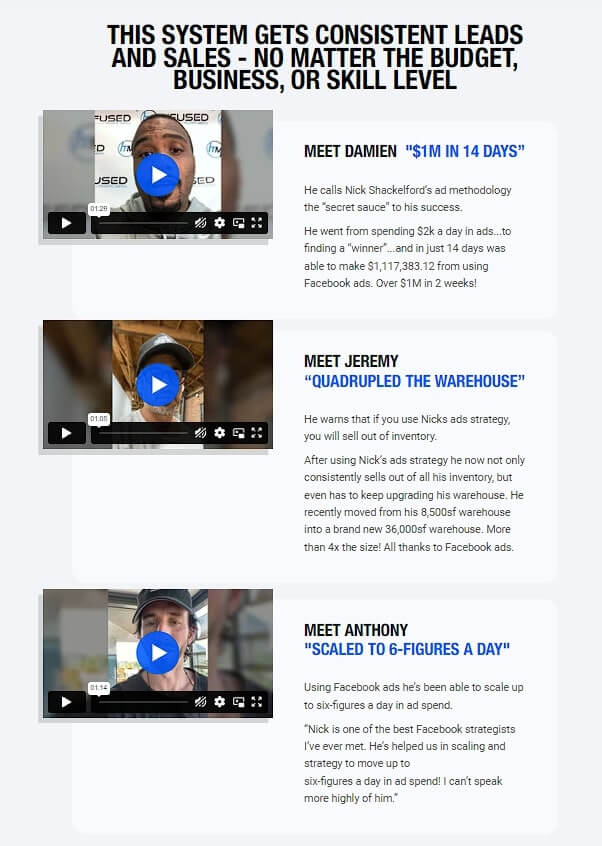
Course with Video Testimonials
Foundr’s course pages are great examples of high-performing landing pages. But keep in mind, in some industries, having too many CTAs can make it seem like you’re more interested in quick sales than in offering a valuable course. This is especially true if you don’t have a famous instructor backing you up. So, it’s a good idea to be cautious with how many CTAs you use
3Code and Compile
Goal: Lead Capture
Category: Factory Automation
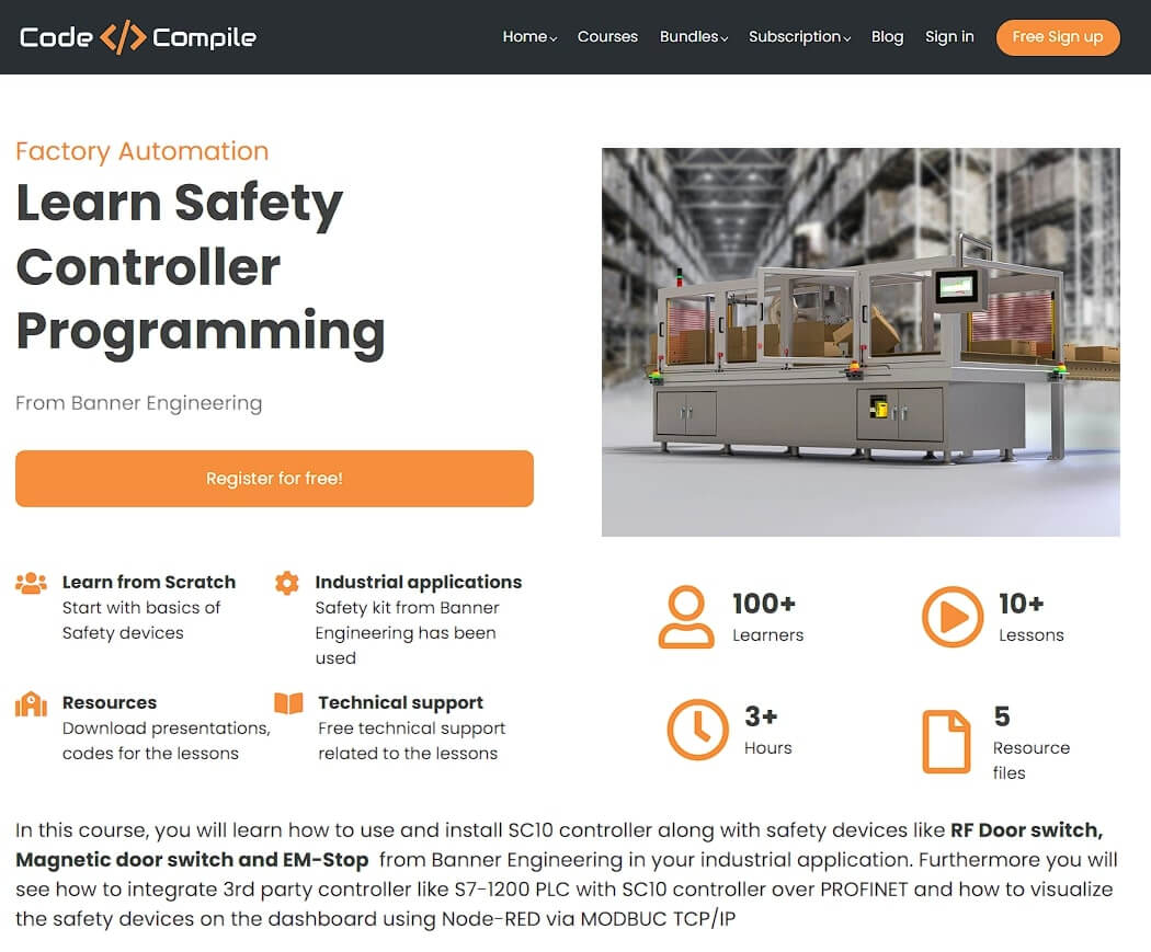
Safety Controller Programming
Embracing a conventional yet highly effective course landing page design, ‘Code and Compile’ adopts a time-tested format. It commences with a value-centric title, followed by articulating the course’s advantages and particulars. A preview video offers a glimpse, complemented by a comprehensive course outline below.
This entry-level course serves as a lead generation tool, collecting student contact information, which paves the way for upselling to more advanced courses.
4Love of Learning
Goal: Subscription Trial
Category: Children / K12
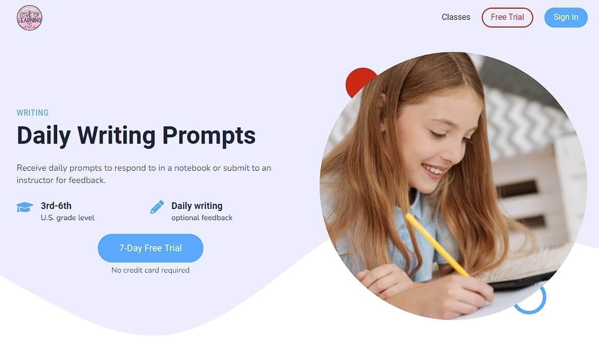
Daily writing Prompts
The Daily Writing Prompts class is part of a subscription program for the school of Love of Learning. It keeps a light-colored, friendly, and approachable design as it targets parents of young children.
The main goal of the course landing page is to get parents to sign up for a trial. The page showcases the course contents and includes a live one-on-one call. Alternatively, it could offer a live free tutorial webinar as an entry point for multiple learners at the same time.
This landing page focuses on simplicity and a clear value proposition with the 7-day free trial. It could be improved by adding review, an FAQ section, or a video of the instructor welcoming new students.
5Masterclass
Goal: Annual Subscription
Category: Edutainment
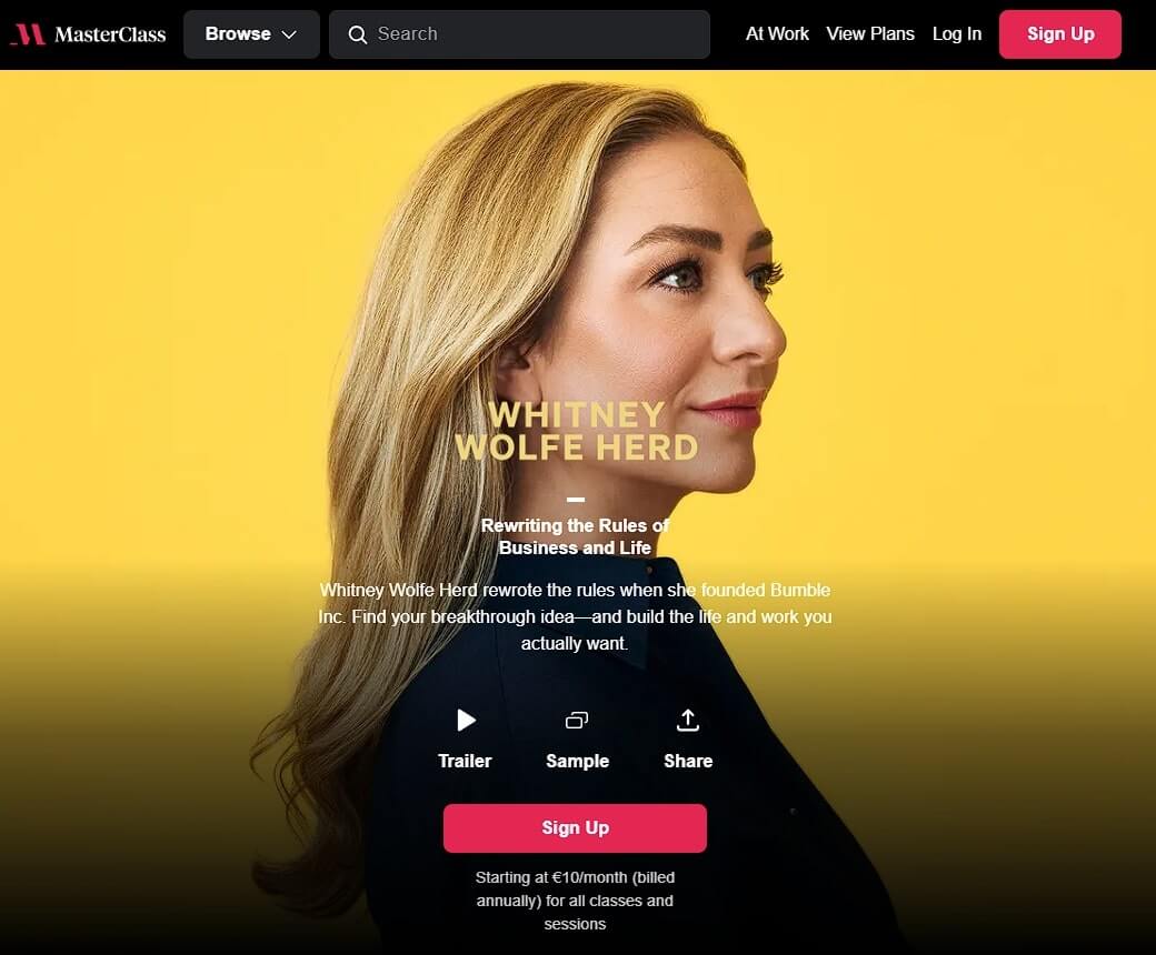
Another membership site with hugely popular online courses is Masterclass, who uses a Netflix-style edutainment (education + entertainment) model. Due to their famous instructors, the above-the-fold focus is a famous instructor.
Following below are a trailer and a video sample of the course. Masterclass avoids adding testimonials to their pages, they prefer to showcase the other famous instructors below as part of their social proof.
Similarly, the headlines focus on the instructor rather than the course topic, with a very simple and clear “Sign up” call-to-action at multiple places.
As an exception to the above examples, Masterclass offers a corporate subscription, and thus adds a secondary CTA leading to a contact form with the call-to-action “Level Up Your Team”.
Elearning Page Templates for Your Online Courses
When creating a website for online education, focus on optimizing your homepage and course landing pages. These are the key areas where you’ll direct the majority of your traffic through marketing activities.
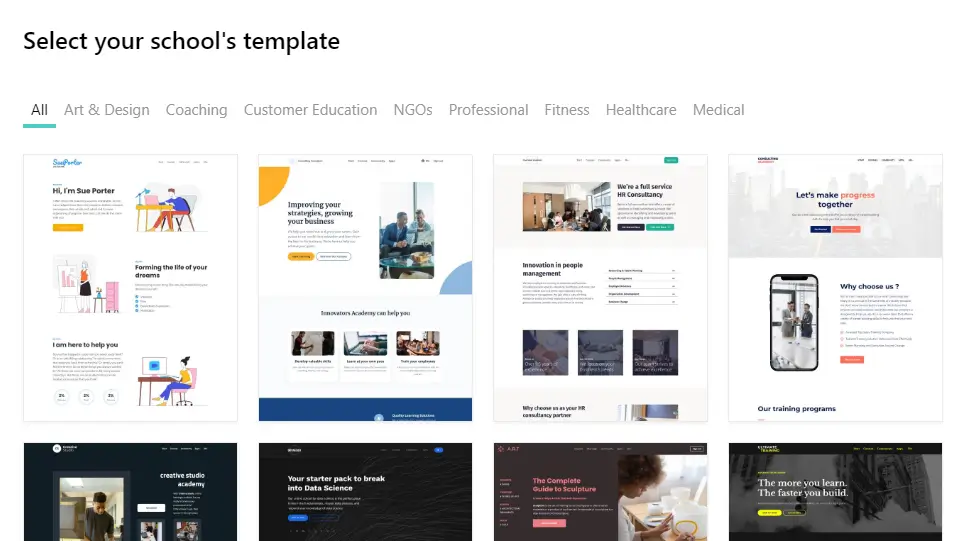
LearnWorlds’ elearning website builder features hundreds of templates to make your educational site uniquely your own. When crafting your homepage, simply select the template that resonates with your vision and edit it as effortlessly as a Word document!
Expert Tips As a Final Treat
A well-crafted course landing page can elevate sales, drive conversions, enhance your brand, and elevate the user experience.
Ensure your landing page leaves a lasting impression with tailored content for your target audience.
For that final touch of expertise, here are some essential tips to optimize your landing pages:
So, enjoy building your online course sales pages and optimizing it for conversions.
We invite you to take advantage of LearnWorlds’ 30-day free trial and get started with your online school today. Discover how simple, easy, and fun it is to create effective landing pages.
Nick Malekos is a Senior Digital Marketer in LearnWorlds. He is a results based and well-rounded Digital Marketer with years of experience in the education industry, writer and digital literacy trainer.
Rosemary is LearnWorlds’ Content Marketing Manager. She has over 2 decades of experience in omnichannel marketing and content writing for the IT and SaaS industry. Her expertise lies in crafting effective content marketing strategies that attract, engage, and nurture customers, enabling LearnWorlds to reach its target audiences with precision.

