11 Successful Black Friday Landing Page Examples To Inspire You
Table of Contents
Black Friday is fast approaching and is one of the year’s most significant shopping events for physical and online stores! This year, it falls on November 29th, and many businesses are already gearing up. They’re updating their websites, doing SEO optimizations, and running A/B tests to maximize attention on their exclusive deals and discounts.
Since Black Friday is just one breath away from the holiday season—it’s high time you put those discounted price tags out and start promoting and selling online courses to new customers.
Never done it before?
Don’t worry; Black Friday marketing isn’t substantially different from what you usually do. You just need to spice things up a bit. We’re here to help you update your sales page to make it eye-catching, super-attractive, and irresistible!
In this blog post, we have collected 11 great Black Friday landing page examples to inspire you and help you promote your online courses by revamping your landing page design (and messaging).
Table of contents
11 Successful Black Friday Landing Page Examples To Inspire You
Let’s see some examples that will inspire you to build an irresistible landing page for an unstoppable Black Friday weekend and beyond!
#1 Tony Robbins
Industry: Life Coaching
Style: Inspirational/Motivational

Through his 2022 holiday marketing campaign, Tony Robbins celebrates the beginning of the holiday season with a simple, elegant, yet powerful image on the hero section of his landing page. For those who need that extra push, Tony helps them figure out how to start by offering a quiz. Instead of letting visitors leave the site right away, he gives them a reason to stay a little longer, increasing their odds of buying.

Tony focuses a lot on the messaging of his offering, through which it’s clear that he wants to empower people. He encourages site visitors to explore the solutions he offers to help them “master every area of their lives.”
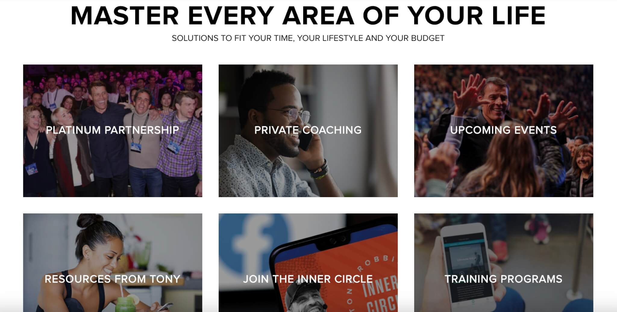
The product pages are also super easy to navigate. Each offering leads to a dedicated landing page with more information, bold messaging, and attractive visuals.
#2 Passion for Savings
Industry: Money Management
Style: Product Listing/Blog
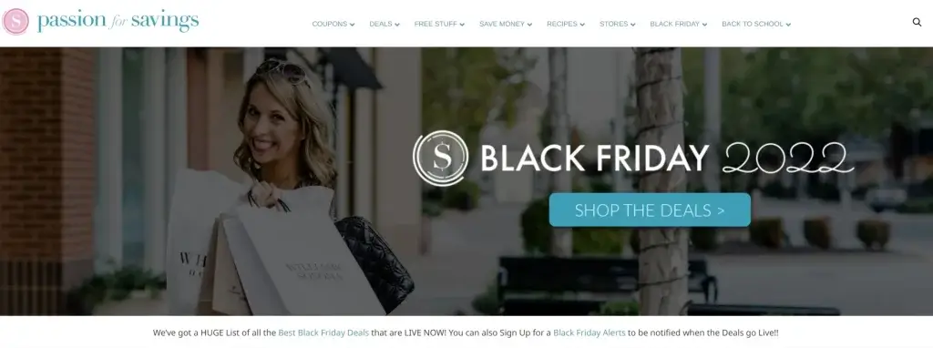
Passion for Savings is a website that features coupons and online deals and shares money-saving tips. For its Black Friday campaign, the company featured a hero image showing that the sales season is officially here. A CTA button takes people directly to the main page of interest, intending to lead them to check out the Black Friday deals.
Below the main hero section, you can see a section divider and a clear headline directing site visitors to two other pages—Best Black Friday Deals and Black Friday Alerts. This does so without disturbing the flow of the copy or impeding other critical elements on the page.
The Black Friday Alerts are a great lead magnet for those who want to opt-in to stay up to date with upcoming deals. It’s also practical because it doesn’t ask people for many details – just their first name and email address.
Overall, this landing page is clean and has lots of white space, giving it a proper structure.
#3 EngageBay
Industry: Email Marketing Software
Style: Playful
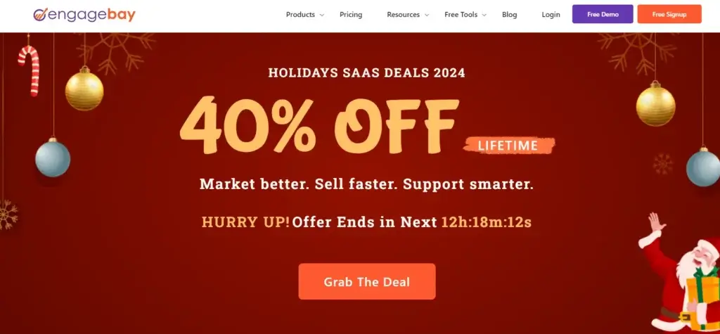
EngageBay has created a dedicated landing page to promote its big holiday sale, including all significant upcoming holidays (e.g., Black Friday, Cyber Monday, and Christmas). The company decided to combine these holidays in the same campaign. To spice things up, it created its version of holiday sales, giving a unified headline, “Holidays SaaS Deals 2024.”
The main section of the landing page immediately presents the upcoming offering, ‘40% OFF Lifetime’, using bold letters. Visitors are then prompted to provide only their email address to be notified as soon as the offer goes live. This is an excellent and direct example of creating anticipation for potential customers.
An effective marketing strategy always involves talking directly to the target audience and highlighting the benefits without much fanfare (Market better. Sell faster. Support smarter).
#4 RafflePress
Industry: Website Design, WordPress plugins
Style: Informative
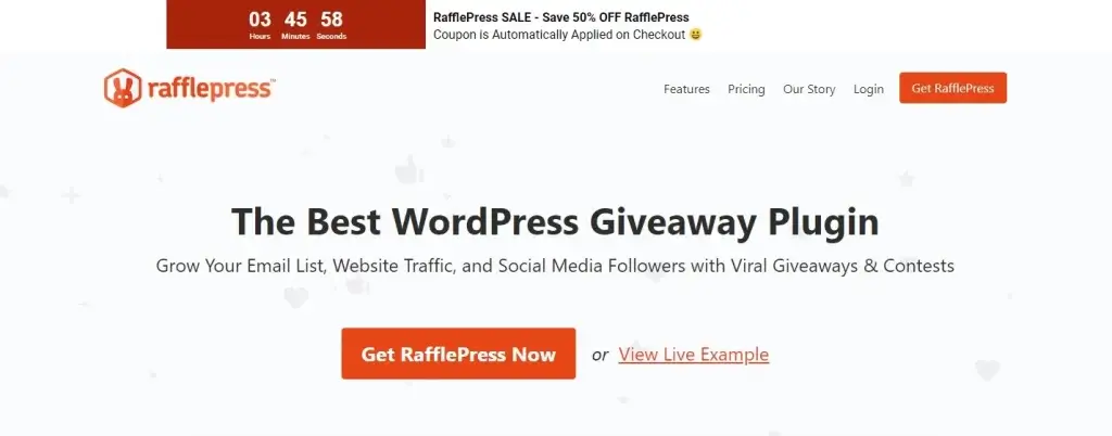
RafflePress, a WordPress plugin for building contests and giveaways, offers an excellent example of a giveaway that can be used in any promotional campaign.
The company creates a special offer banner with a countdown timer and quickly describes the sale. At this point, it is important to make it as easy as possible for the site visitor to access the sale and learn how to claim their coupon, and RafflePress does it well.
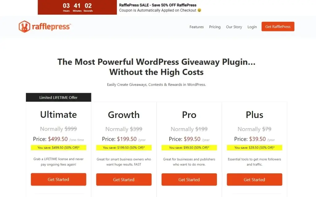
Apart from that, RafflePress’s Black Friday 2022 deal offered 50 percent off all its plans, which is more visible through its pricing page. From there, you can tell that prices have dropped, offering potential customers the limited LIFETIME opportunity to join.
#5 HandleTheHeat
Industry: Cooking/Baking
Style: Bold, Enticing
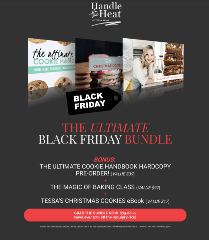
Chef and baking master Tessa Arias is behind HandleTheHeat, a successful baking business specializing in desserts and cookie making. In 2021, to take full advantage of the Black Friday season, Tessa built a landing page and promoted her course as part of a discounted bundle.
The course bundle included a hard copy handbook with her baking recipes, a baking class, and a Christmas cookies ebook—all three in one. This discount saved over 50% off the regular price and presented itself as a winning opportunity. To create a sense of urgency, it’s mentioned that this is a limited-time offer.
On the homepage, Tessa encouraged people to sign up for her email list by offering a guide as a free product. This free cookie customization chart is a great incentive to sign up.

Apart from the Black Friday deal, Tessa knew she had more chances to increase those conversion rates by encouraging people to become subscribers first.
💡After all, email marketing works! You can learn more about it here.
#6 I Create Art
Industry: Online art school
Style: Playful, Educational
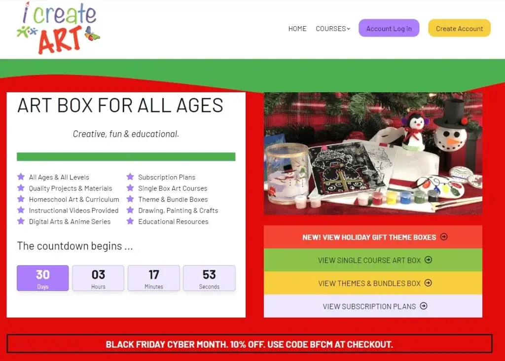
I Create Art is an online art school for kids and adults who like to celebrate the Christmas holidays. This becomes obvious as you visit their landing page. For their Black Friday marketing campaign in 2020, they featured their course art boxes and promoted them as holiday gifts.
They also offered theme and bundle boxes, single-box courses, holiday theme boxes, and a special discount on their subscription plans.
The countdown timer to Christmas is the first thing you notice when you land on the page. The Black Friday and Cyber Month deal appears further down the page, but it still stands out compared to other elements, and it’s highlighted with bright colors.

The color combination of red, green, yellow, and black creates playful Christmas-y vibes that get the site visitors in the mood for holidays. It prepares them to step back, unwind, and start investing their money in the best possible way. Besides, art education is all about unleashing your creativity and having fun, which go well with the holiday spirit.
To purchase the courses, site visitors need to enroll in the school and then place their order. This explains why the main call-to-action button remains the “Create Account” button at the top right corner of the homepage.
#7 The School of Calisthenics
Industry: Online fitness coaching
Style: Bold, Inspirational
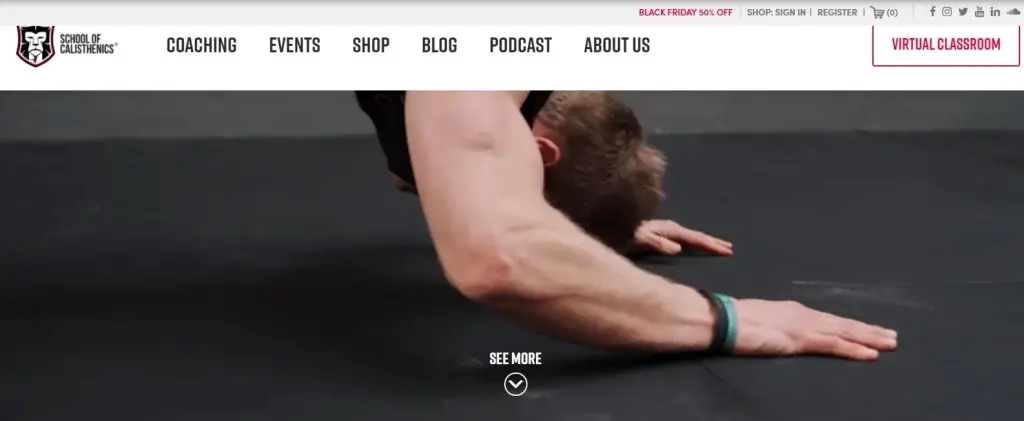
The School of Calisthenics has built a spot-on landing page that provides the information its target audience needs.
Their web page is clean, with all the page elements arranged to make the copy easy to read. Each section has its own purpose, giving the page a balanced structure and improving the overall user experience.
In 2021, The School of Calisthenics nailed the page design and effectively communicated the Black Friday special offer.
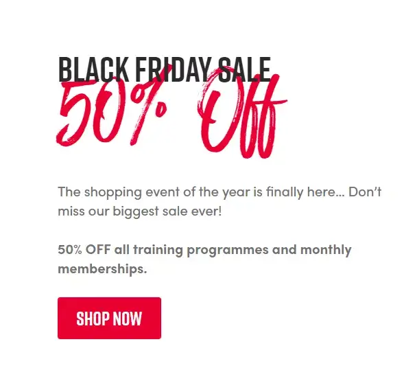
The clear and bold CTA led prospective customers to a dedicated Black Friday page with a countdown timer and an exclusive 50% off sale.
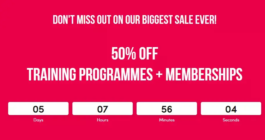
In addition to training programs, potential customers could enroll in the school and get a membership at half the original price.
The School of Calisthenics focused on FOMO (Fear of Missing Out) with phrases like “Don’t Miss Out” and listed all the subscription benefits, encouraging people to sign up for their courses.
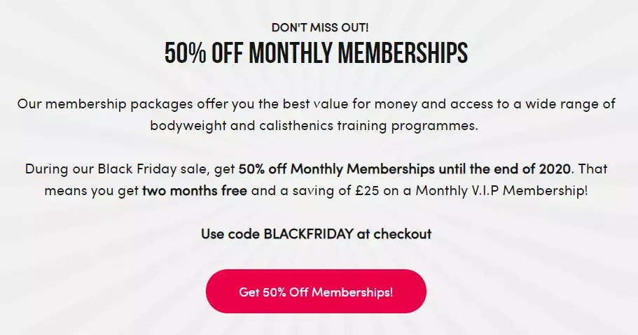
They also explained straightforwardly how people could claim the discount using the Black Friday code at the checkout.
#8 Canine Principles
Industry: Online school for dog training
Style: Informational
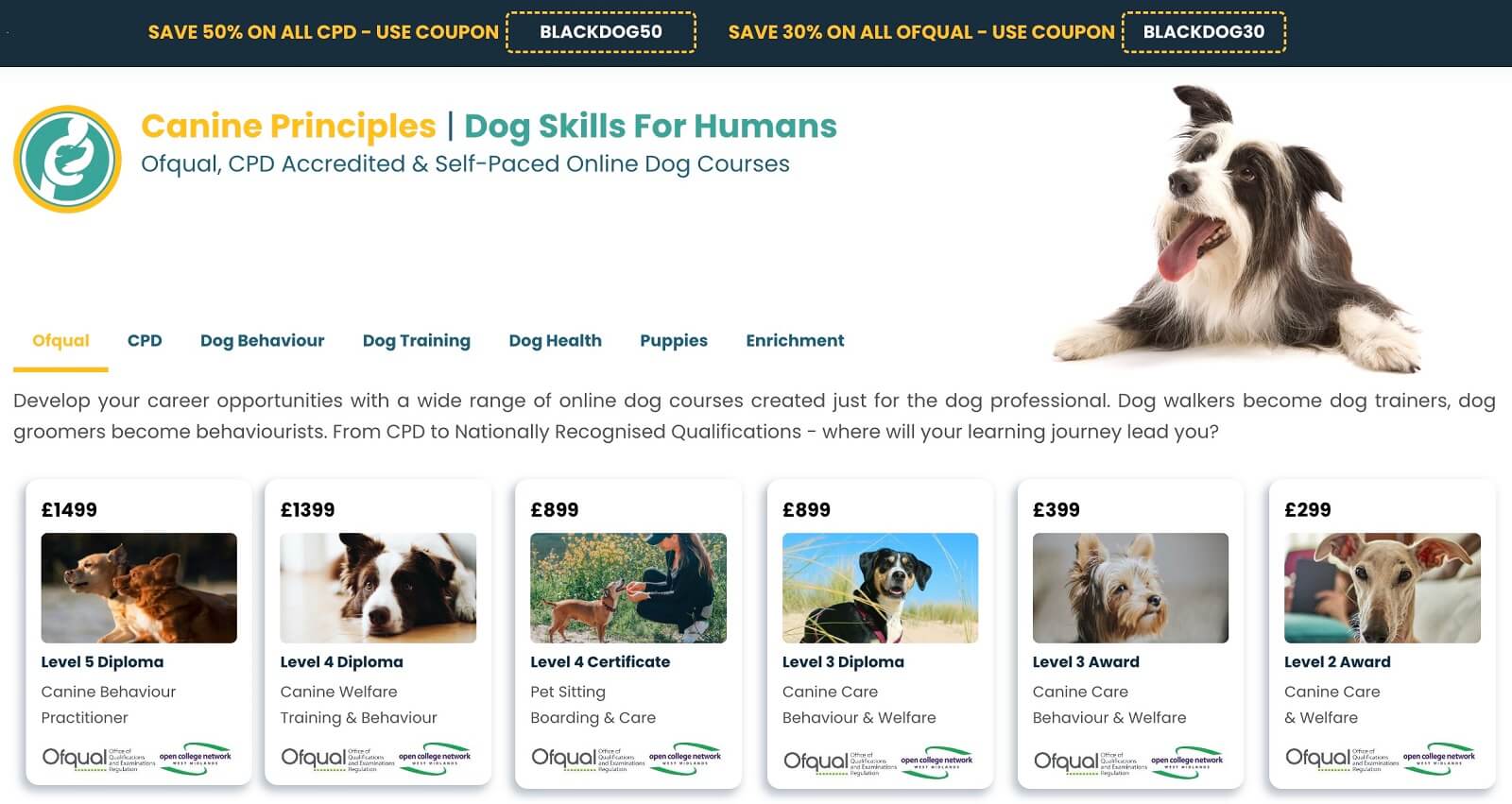
Canine Principles is another excellent landing page example that shows how you can entice your site visitors to buy during the holiday season.
For their Black Friday sale, they offered coupons with 50% and 30% discounts, depending on the type of course. They have smartly named the coupons “Blackdog”—an apparent reference to Black Friday that works well with the topic of the courses.
Apart from the discount, the school also offered a free course (3 to choose from), incentivizing more people to sign up.
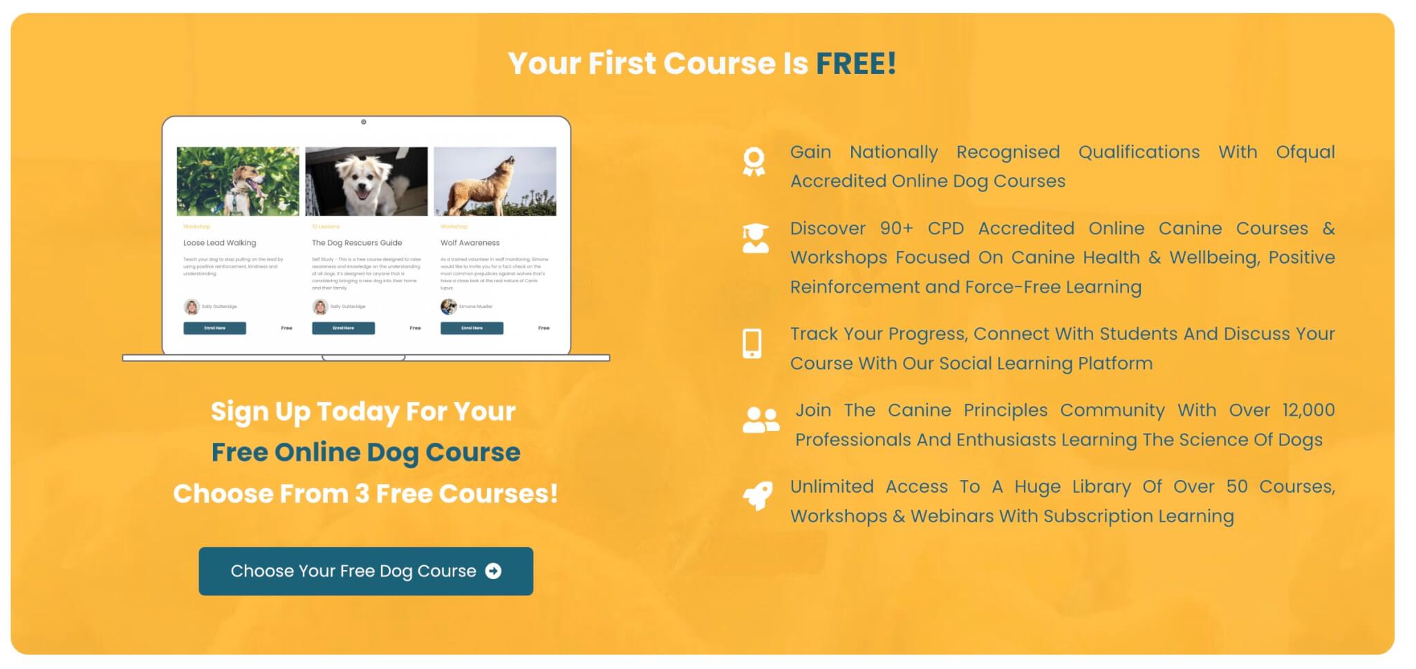
What we loved about Canine Principles is that the site also includes customer testimonials and features their social media channels and online community. This is an excellent addition to the kind of services they offer.
#9 ThemeForest
Industry: Web design, CMS
Style: Bold, attention-grabbing
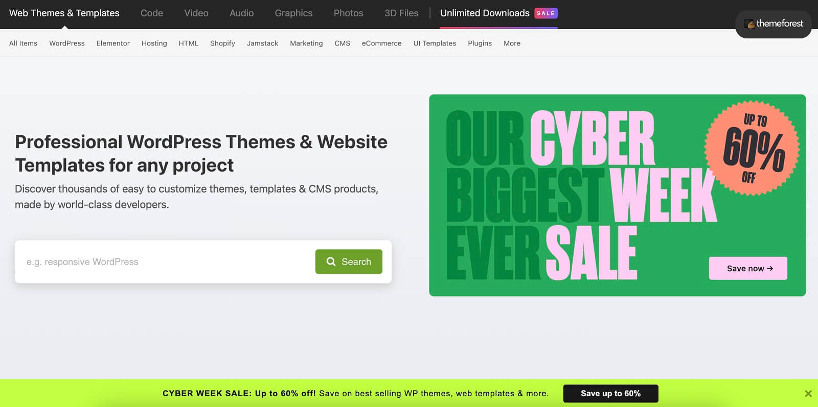
ThemeForest performed a … triple attack, announcing what they call “their biggest cyber week sale ever,” with discounts reaching 60%. The sales are communicated in three sections on the page: the upper right, middle, and bottom.
The main banner in the middle of the page certainly manages to catch the reader’s eye. It is colorful and modern, eluding a sense of excitement without being one bit tacky. To bring the percentage of the sales to our attention, ThemeForest uses a hue of peach that hovers between bold and pastel.
#10 Christie’s Education
Industry: Online learning, Art
Style: Sophisticated, discreet
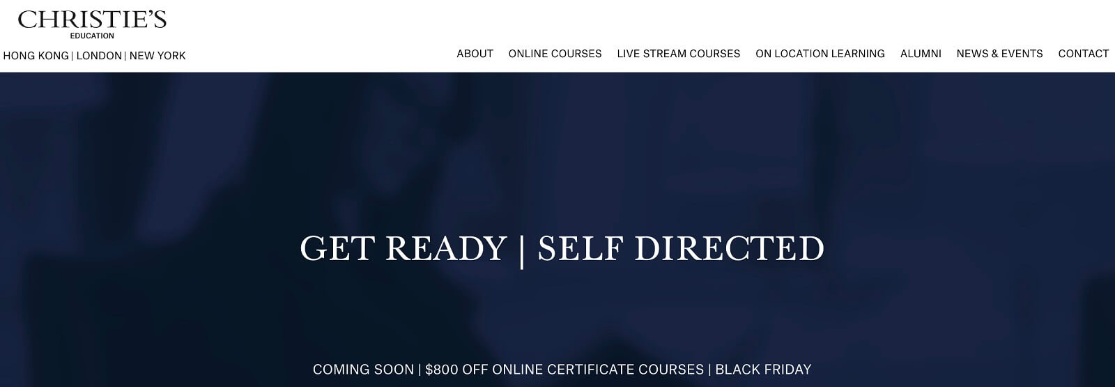
Christie’s Education offers accredited on-site and online courses in Art history and the Art market. Last year, their Black Friday offer was a $800 discount on self-directed online certificate courses.
The offer is communicated through an elegant, deep-blue banner with a minimalistic design. Instead of being the prominent message, it is discreetly mentioned on the bottom.
What we love about this offer is how it creates anticipation since it was communicated about two weeks before Black Friday. We can’t help but love its simplicity, which conveys that the quality of the courses, rather than the reduced price, remains their biggest selling point.
#11 Target
Industry: Retailer
Style: Bold, simple

Target announced its 2022 Black Friday sale with a bold black banner. The banner initially announces that the deals are here but does not provide specific information.
Scrolling down, we see that different categories offer different discounts, either as a percentage of the original price or an amount taken off. We like this approach of offering different discount options as it reinforces the feeling that “there’re plenty of options here.”
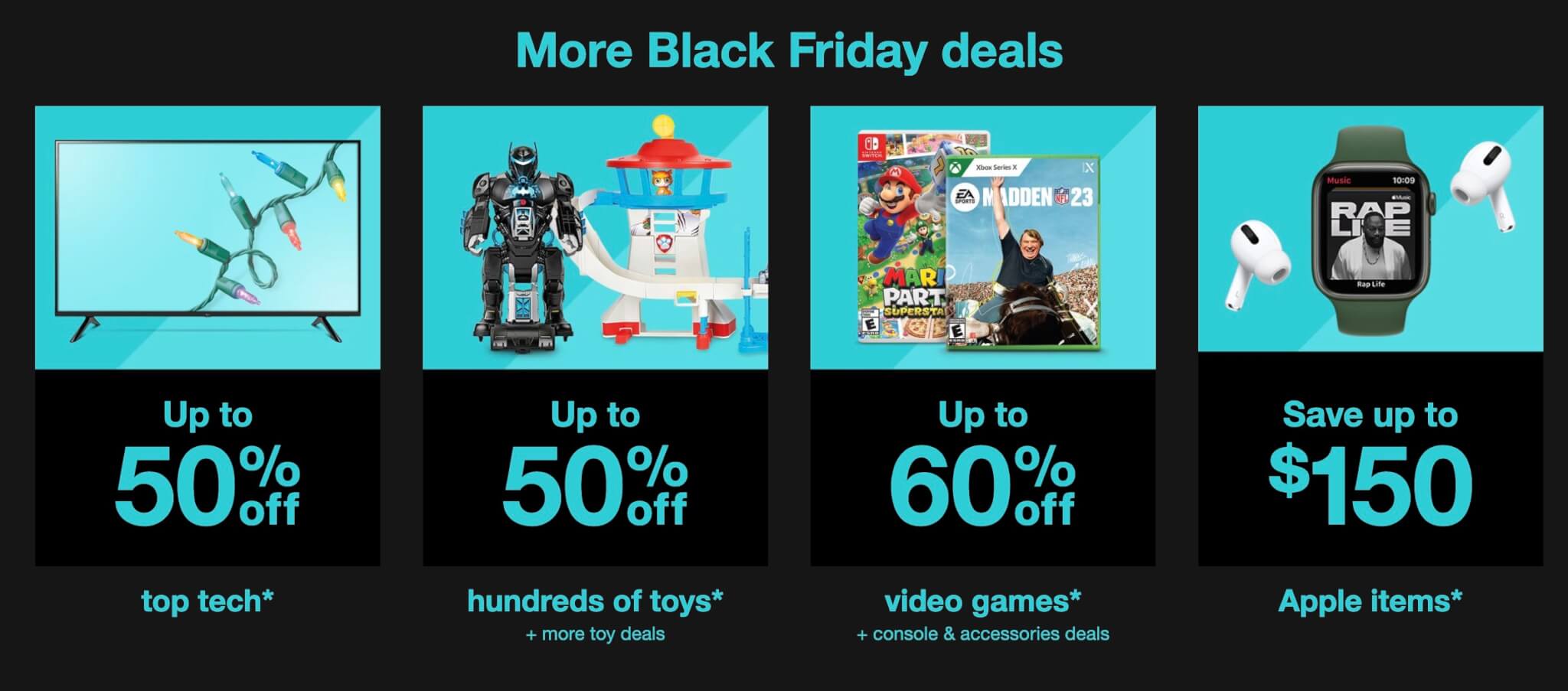
We also can’t help but love the simple, elegant design that Target has chosen.
Key Elements of a Black Friday Landing Page
The eCommerce market is on fire every year on Black Friday, warming up consumers for the upcoming holiday sales!
You’ve got to grab this opportunity and create an effective Black Friday landing page that stands out and encourages people to interact with you. The page copy and website design should lead people to action that aligns with your goals—opting into your newsletter, reaching out to you directly, or buying your course (the ultimate goal).
💁Here’s How to Sell Your Courses on Your Shopify Store
These are the key elements you need to focus on when building your own landing page to optimize conversions:
These elements should help you create a landing page that stands out and clearly explains to potential customers what they can get from this year’s online Black Friday sales. Play around to create a landing page template you can tweak and resume yearly.
💡With LearnWorlds, you don’t need a separate landing page builder to create fantastic landing pages.
LearnWorlds Online School Site Builder enables you to build a landing page, sales page, or product page within a few minutes and with zero coding. Choose from a variety of ready-made templates and customize your landing page with countdown timers, pop-ups, special offers, testimonials, animations, fonts, and more!
Ready to Build a High-Converting Black Friday Landing Page?
The key to an effective digital marketing strategy for Black Friday is to build a landing page that will present your courses smartly while offering a pleasant user experience.
Paying attention to all the elements outlined above will help you showcase your special course bundle or offer and create a high-quality, amazing landing page that converts.
So, have you prepared your Black Friday deals yet?
Get your free 30-day trial with LearnWorlds today and create your Black Friday deals on online courses with our state-of-the-art platform!
P.S.: Don’t forget to prepare for the other important dates between Black Friday & Cyber Monday. Small Business Saturday is the equivalent of a “Small Business Black Friday Sales” and then get ready for the holiday season for a post-Black Friday sales period:
Dec. 25 – Jan. 2: Hanukkah
Dec. 21: Super Saturday
Dec. 24: Christmas Eve
Dec. 25: Christmas Day
Dec. 26: Boxing Day
Dec. 31: New Year’s Eve
Frequently Asked Questions (FAQs)
Why do we have black Friday sales?
Thanksgiving in the U.S. is considered the first day of the Holiday shopping season. Many employees take a long weekend off starting on Thanksgiving and take the opportunity to do their holiday shopping. Retailers started competing on opening hours and discounts over the Friday after Thanksgiving, which was eventually named Black Friday.
When will Black Friday sales start?
Black Friday for 2024 is on the 29th of November.
How long do black Friday sales last?
Some offer discounts throughout November, while others offer them only on Black Friday and the follow-up weekend, sometimes including Cyber Monday.
Further reading you might find interesting:

Androniki Koumadoraki
Androniki is a Content Writer at LearnWorlds sharing Instructional Design and marketing tips. With solid experience in B2B writing and technical translation, she is passionate about learning and spreading knowledge. She is also an aspiring yogi, a book nerd, and a talented transponster.
Rosemary is LearnWorlds’ Content Marketing Manager. She has over 2 decades of experience in omnichannel marketing and content writing for the IT and SaaS industry. Her expertise lies in crafting effective content marketing strategies that attract, engage, and nurture customers, enabling LearnWorlds to reach its target audiences with precision.

