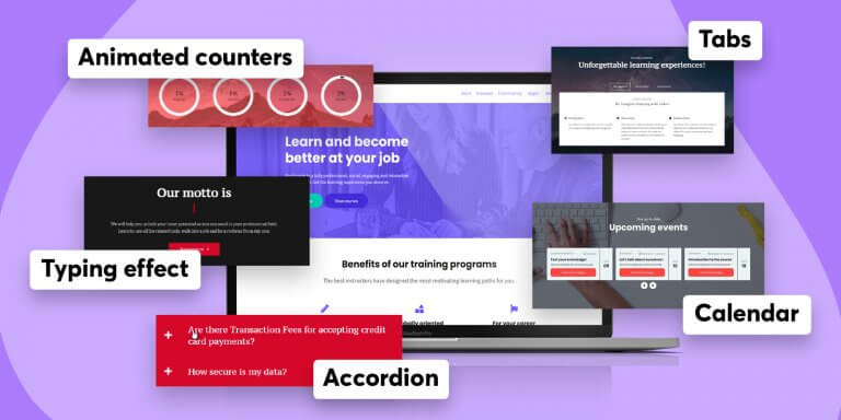
LearnWorlds school owners, like you, have at their disposal the most advanced and most user-friendly Site Builder in the eLearning industry (yes, it’s a fact, and yes, we like to brag about it!).
When you’re in the business of building a great online school, the last thing you want is to have a website that doesn’t communicate how buzzing your content is. You should do everything in your power to develop a site with social proof, easily-retrievable information, and eye-catching visuals.
But how to do that? Wouldn’t it just be much easier if you could use, let’s say, new widgets? Yes, you can!
You can add your school with five ultra-useful, brand new widgets to your school:
| 1. Calendar |
| 2. Animated counters |
| 3. Typing effect |
| 4. Tabs |
| 5. Accordion |
Your Site Builder already sports loads of exciting top-notch functionalities to enrich your visitors’ experience and increase your school’s conversion rate. You have a universe of templates and widgets that help you engage with your visitors, build mailing lists, and increase conversion.
Let’s take a look at these widgets!
Go to: site builder → edit school site → click ➕ from any column→ add widgets
📆 Calendar
The new LearnWorlds’ event aggregator for your school can showcase dates of your live events, drip-feed & cohort courses scheduled content, and file assignment deadlines. And you can display different content to logged in students and logged out visitors!
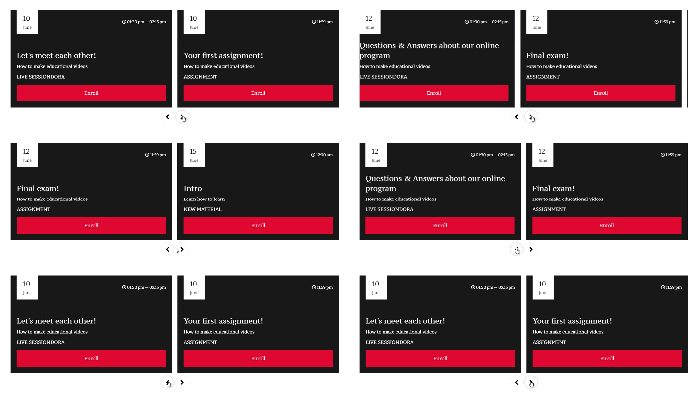
Here are some practical examples that you can copy in your school:
Showcase your school’s freshly-released content
You can set up your calendar so even logged-out users can see your upcoming program and enroll in your courses. Two birds with one stone: show your school is alive and kicking and shorten your customer journey.
The calendar is especially useful to showcase your live sessions, drip-feed & cohort course dates, and file assignments with specific deadlines.
Help your students stay on track and reduce dropouts.
This is my favorite thing about the LearnWorlds Calendar. You can provide a dashboard-like experience for your students by tailoring what each of them sees. In fact, you can use the calendar widget to display all the upcoming events relevant to each logged-in student, depending on the courses they are enrolled in:
This functionality has three great perks. First, it helps you reduce your efforts to send individual reminders to your students. Second, it helps your students keep track of their activities and manage their time. Third, it encourages course completion, which – as you know – is the most crucial factor when it comes to external recommendations, upselling and cross-selling.
Invite new students to enroll
Also, buttons in your calendar adapt depending on whether a student is logged in and enrolled or logged out. Logged-in students will be prompted to join the class, while logged-out visitors will be prompted to enroll. In this way, logged-in students won’t miss your content, and logged-out students will enroll easily. >>
🎯 Animated circle & numeric counters
The animated circle and numeric counters provide you with a beautiful and eye-catching way to display data on your site. How? As your visitors scroll down, they will see the number going up and the circle graph progressing. It’s just easier to show you:

Display circle or number counters to provide your visitors with social proof about your school, using reliable and eye-catching data.

For example, to illustrate stats about students’ testimonials or the variety of courses in your school, you can take these data points:
And of course, you can customize them as you wish, percentage, icons, currency… >>
💫Typing effect
You know the feeling when you see a friend is typing on WhatsApp, and you can’t help but stare at your phone while a sense of suspense builds up? Now you can recreate that personal closeness and expectation-building feelings for your school site too!
The typing effect allows you to catch your visitors’ attention by displaying text as if it was typed while they read it. Lots of words, for this simple yet highly captivating (and a little hypnotizing) widget, here’s an example:
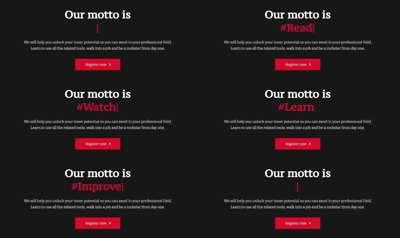
Use this to draw attention to your key information in your school. For example, the types of careers that your students might pursue, your key topics, etc.… Or anything else you want!!
💡 There’s also a sweet trick you want to take advantage of. If you add this | operator, the widget will only erase the different words between the previous and the following sentence. i.e., if you type in the side form relevant box:
“With our IT certifications, you can work at Google | With our IT certifications, you can work at Microsoft | With our IT certifications, you can work at Amazon AWS | With our IT certifications, you can work …anywhere you want!”
The result will be:

You can also set how quickly the typing effect occurs, how much delay there should be before starting or backspacing, set the animation to loop (or not), and font size. >>
📚Tabs
The new Tabs widget helps your visitors and students quickly spot the information they need without having to scroll down or getting distracted.
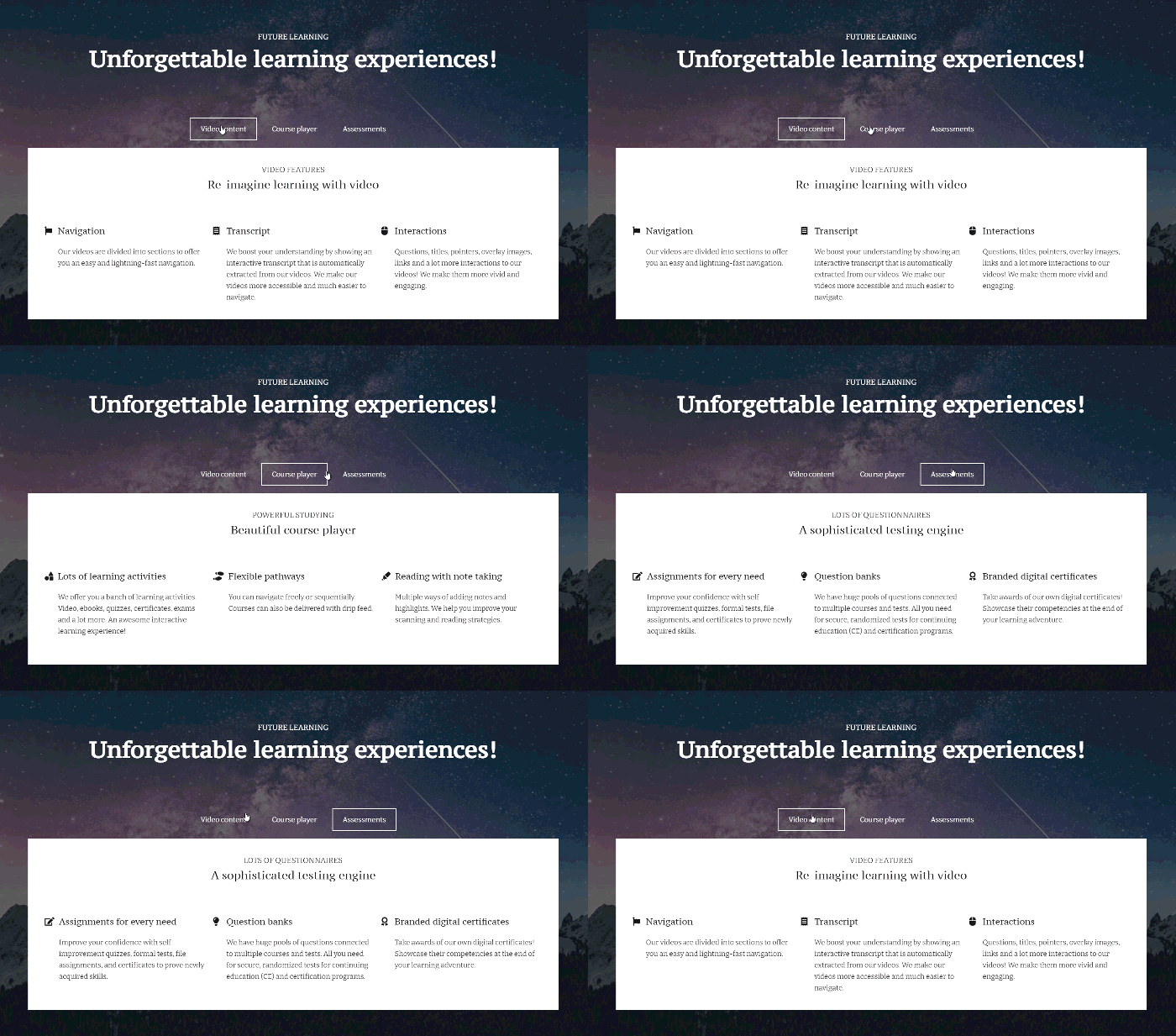
You can use tabs to organize pieces of information related to each other and that do not need to be accessed simultaneously.
So, for example, you can use this widget to introduce at once different fields that your course covers, organize your about page, display instructors bio and expertise, showcase student testimonials, talk about all the different types of content your LearnWorlds school can offer.
You can also add any widget you like within each tab and customize its look & feel. Straight forward for your students and visitors to read, easy for you to create! >>
🎶Accordion
Similar aim, different visual effect! Much like the tabs, the accordion widget can also help you consolidate information in one place. By minimizing the scrolling height of your page and facilitating a fast and dynamic exploration of topics, you allow users to go straight to what interests them the most.
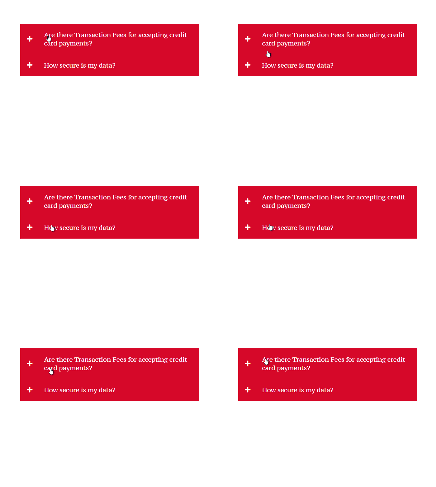
Accordions are the best solution to expand on the benefits your school provides, answering common questions (note: we also have a widget with pre-filled FAQ), and talk about key concepts. It’s almost like extra info on-demand; let the users decide what they want to know more about!
Extra tip: to create beautiful tabs and accordions, you can use one of our designer-made sections that already include your stylized widget. If that’s not time-saving, what is! >>
Make your school buzz with the new Site Builder widgets!
Calendars, animated counters, typing effects, tabs, and accordions are here to make your LearnWorlds school even more interactive and engaging.
Creating an engaging website where users can easily find information is not about having a beautiful website per se. A well-thought-out browsing experience is about giving the right first impression, showing you’re professional and legit, reflect the quality of your school content, and beat the competition too.
With LearnWorlds Site Builder, you get beautiful animations, countdown timers, and tons of widgets that enhance your school brand, engage your audience and get more students.
LearnWorlds eLearning platform is in constant acceleration to make your online school an unforgettable experience for your students.
What are you waiting for?
Or

Sara Cortellazzi
Sara is on a mission to keep up to speed the LearnWorlds' community with the latest feature releases and more. She lived and traveled all around Europe, gaining an MSc in Marketing, experience in tech, and passion for education.

